Using Dashboard
The Dashboard page allows users to analyze identity audit events and history entries data that have been aggregated according to key performance indicators (KPIs) and stored as online analytical processing (OLAP) data cubes in the DirX Audit Database. DirX Audit provides a set of pre-defined OLAP data cubes that cover the most commonly used identity audit KPIs and allows you to configure your own customized OLAP data cubes.
To view and analyze this data use the available product or public Dashboard views that match your interests. These views consist of several dashlets presenting aggregated data such as totals of password changes for the past month. DirX Audit provides pre-defined product views and the flexibility to create and set up the layout and contents of custom views.
This chapter describes how to:
-
Navigate the Dashboard page.
-
Manage Dashboard views.
-
Change Dashboard Settings.
-
Export the Dashboard data to a file.
-
Configure the data for a Dashlet.
-
Add a new Dashlet.
Navigating the Dashboard Page
The layout of the Dashboard page is shown in the following figure.
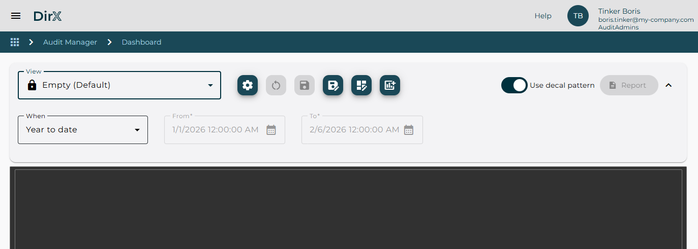
As shown in the figures, the Dashboard page consists of a filter definition area and a display pane.
The filter definition area allows you:
-
Select a Dashboard view, which provides a predefined set of dashlets and filters and manage your views. For details, see “Managing Dashboard Views”.
-
Define the time filter.
-
Change the criteria used to display aggregated data.
-
Add a new dashlet to the dashboard. For details, see “Creating a New Dashlet”.
-
Use decal pattern for better visibility of individual chart data.
-
Export aggregated data into a report-formatted file or save dashlet data as an image.
Managing Dashboard Views
You can name and save your private (all users) or public (administrator only) dashboard views which are stored in the configuration database for future use. This allows you to quickly apply frequently used filters without redefining them each time. Simply select a stored view from the View list.
When accessing the dashboard for the first time the only available view is the default Empty dashboard. If you want to use the provided product dashboard views you have to click the
Manage views ![]() icon,
switch to the Product tab, select the product views you want to work with and click the Add to favorites icon. When you return to the Dashboard page the selected product views will be available in the View list.
icon,
switch to the Product tab, select the product views you want to work with and click the Add to favorites icon. When you return to the Dashboard page the selected product views will be available in the View list.
Dashboard views are organized similarly to other views in DirX Audit Manager. For more details on using and modifying the views, see “Managing and Understanding Views”.
Working with Dashboard
This section describes how to work with the Dashboard, including how to:
-
Change Dashboard settings.
-
Add a new dashlet to the dashboard. For details, see “Creating a New Dashlet”.
-
Export aggregated data into a report-formatted file or save dashlet data as an image.
Changing Dashboard Settings
To change the settings for a dashboard, click the Dashboard settings
![]() button next to the view menu buttons.
This action opens the Dashboard layout dialog where you can change the basic grid parameters such as the number of columns or rows in the grid, the grid items margin and enable or disable the single page dashboard layout adapting automatically to the screen size.
button next to the view menu buttons.
This action opens the Dashboard layout dialog where you can change the basic grid parameters such as the number of columns or rows in the grid, the grid items margin and enable or disable the single page dashboard layout adapting automatically to the screen size.
Click Update to save your dashboard settings or click Back to cancel your changes.
Exporting Dashboard and Dashlet Data
To export all dashlets presented in a dashboard into a single file, click the Report button. It is also possible to export an individual dashlet using the Save as image
![]() or the Report
or the Report
![]() button in the dashlet Toggle menu.
Both actions will result in DirX Audit Manager creating an image or report with the selected content that you can save to your local file system using your browser options.
button in the dashlet Toggle menu.
Both actions will result in DirX Audit Manager creating an image or report with the selected content that you can save to your local file system using your browser options.
Working with Dashlet
Each dashlet consists of a title, a Toggle menu with available actions and a display pane.
The title displays the dashlet name but may also contain additional information such as the Date and time filter currently applied to the dashlet data, if it is different from the global dashboard time filter or information about whether the size limit for the displayed data has been exceeded.
If the currently used date and time filter defined in the dashlet settings differs from the setting for the dashboard it is displayed in brackets after the title,
for example Total audit events by month and source (When: Last month).
If an exclamation mark icon appears at the end of the dashlet title, it means that the dashlet data is incomplete because the result size limit has been exceeded.
In this case, we recommend applying a dashboard or dashlet time filter with a shorter time period. You can also change the default value for this limit.
The default value max_page_size = 10000 is defined in the [server_container.rest] section of the
configuration file install_path/conf/defaults/tenant/configuration.cfg.
If you want to increase it for your tenant insert the modified value directly into the tenant configuration file as described in the “Customization Levels” chapter in the DirX Audit Customization Guide.
All actions that can be done with a dashlet are available in the Toggle menu
![]() in the upper right corner of each dashlet, including:
in the upper right corner of each dashlet, including:
-
Change the chart type to chart or table.
-
Clone an existing dashlet to create a new one with the same configuration.
-
Maximize and restore dashlet.
-
Change the dashlet settings.
-
Save and export dashlet data to a file. For details, see see “Exporting Dashboard and Dashlet Data”.
-
Delete the dashlet from the display pane.
Changing Chart Type
To change the dashlet chart type, click the Datatable
![]() or the Chart
or the Chart
![]() button in the Toggle menu.
button in the Toggle menu.
Cloning Dashlet
To create a new dashlet with the same configuration as an existing one, click the Clone
![]() button in the Toggle menu.
This action creates a new dashlet with all the settings copied from the original dashlet. You can then modify the settings as needed and save the new dashlet.
button in the Toggle menu.
This action creates a new dashlet with all the settings copied from the original dashlet. You can then modify the settings as needed and save the new dashlet.
If there is not enough free space in the dashboard display pane, the Clone icon is marked with a red exclamation mark and the cloned dashlet cannot be inserted. You have to resize existing dashlets or change the size of the dashboard.
Maximizing and Restoring Dashlet Display
To display a single component in the entire Dashboard area, click the Maximize
![]() button
in the Toggle menu. It is especially useful in dashboards featuring multiple small size dashlets, you can maximize the selected one and view its details in the full screen mode.
To restore the display to show all dashlets again, click the Restore
button
in the Toggle menu. It is especially useful in dashboards featuring multiple small size dashlets, you can maximize the selected one and view its details in the full screen mode.
To restore the display to show all dashlets again, click the Restore
![]() button
in the Toggle menu.
button
in the Toggle menu.
Modifying Dashlet Settings
To modify the settings for a dashlet, click the Dashlet settings
![]() button in the Toggle menu.
This action opens the Dashlet settings dialog for the respective dashlet, where you can change the data provider configuration or the display format. For more information about how to use this dialog, see the section
“Changing Dashlet Settings”.
button in the Toggle menu.
This action opens the Dashlet settings dialog for the respective dashlet, where you can change the data provider configuration or the display format. For more information about how to use this dialog, see the section
“Changing Dashlet Settings”.
Managing Dashlets
Creating a New Dashlet
A new dashlet can be added to the dashboard when there is at least 1 free space cell available in the dashboard display pane.
If there is no free space the
Add dashlet ![]() icon is marked with a red exclamation mark and
clicking this button only displays a warning message.
It is necessary to either remove or resize any existing dashlet to make free space for a new one.
icon is marked with a red exclamation mark and
clicking this button only displays a warning message.
It is necessary to either remove or resize any existing dashlet to make free space for a new one.
When it is possible to insert a new dashlet a Add a new dashlet page opens displaying the provider and dashlet definition selection menus. These menus allow users to choose the source of data for the new dashlet. You can select one of existing dashlet definitions which include a preselected configuration of facts and dimensions using a specific fact table as well as chart type configuration. You can also select a data provider only which subsequently opens the same Dashlet settings menu as a dashlet definiton does but there will be no preset configuration items and everything will have to be configured manually. The configuration of a new dashlet is explained in the following section “Changing Dashlet Settings”.
For more details on the configuration of facts, dimensions and fact tables, refer to the DirX Audit Administration Guide.
Changing Dashlet Settings
Clicking the Dashlet settings
![]() button in the dashlet Toggle menu results in opening the dashlet configuration options. This very same configuration page is also displayed when adding a new dashlet after you select a dashlet definition or data provider.
button in the dashlet Toggle menu results in opening the dashlet configuration options. This very same configuration page is also displayed when adding a new dashlet after you select a dashlet definition or data provider.
The page is divided into three collapsible areas: Title, Data provider and Dataset which includes a Chart settings subsection.
It is possible to change the dashlet name in the Title field, you can also use localization keys to enable dynamic dashlet title changing based on existing location bundle entries and the selected application language setting.
The Data provider displays the selected fact table. You can select an additional filter for the fact table in the Filter by parameters menu where you first choose the dimension and then the value to be filtered. For example, when choosing the Audit events fact table data provider you might want to see only such events which have the Add Object value in the Event Operation.
The Dataset settings modify the way the data is presented. The Chart type selection allows users to choose one of the following chart types by clicking the respective icon: Pie, Line, Line - timeseries, Bar and Bar - timeseries.
The Category expression defines which dimension from the available dimensions list for the respective fact table (selected in the Data provider section) will be used. There must be always at least 1 selected dimension in every dashlet configuration.
The Series expression defines which fact from the available fact list for the respective fact table (selected in the Data provider section) will be used. There must be always at least 1 selected fact in every dashlet configuration.
Additional facts can be added by clicking the + button. The Series name field allows customizing the displayed series name if you wish to change its default name.
The Use series expression switch enables the use of 2 dimensions (1 in the Category and 1 in the Series expression) and 1 fact (in the Value expression) or an alternate setup of only 1 dimension (in the Category expression) and 1 or more facts (in the Value expression).
It is advised to study the fact and dimension configurations in the provided product dashboards and dashlet definitions before customizing your own dashlets. For more details on the configuration of facts, dimensions and fact tables, refer to the DirX Audit Administration Guide.
The Chart settings includes the following options:
Chart area – applicable only to the Line chart type, enables displaying the area below the line in full color.
Stack – applicable only to the Bar chart type, enables stacking Bar chart columns.
Orientation – either horizontal or vertical.
Theme – a selection of predefined color schemes.
Legend – allows you to turn off the display of the legend at the bottom of the chart or select the display method. The Scrollable option is suitable if the chart contains many values.
Tooltip trigger – allows you to set what values the tooltip will display; whether only the value of the current item or the values of all items for a given point on the selected axis.