Home Page
The Web Center Home page is displayed as first page after a login. It can also be invoked later on from a button in the user’s main menu bar.
A home page is a panel divided into a number of sections. Each section displays a plug-in page with a title, some content and a “more” link. Each plug-in is implemented by a separate Struts action and loaded asynchronously into the home page.
Web Center supports two types of plug-ins: property pages to display attributes of an object, and lists to display entry lists. The default home page includes a property plug-in with some attributes of the logged-in user and two list plug-ins with the roles assigned to the logged-in user, and his open tasks.
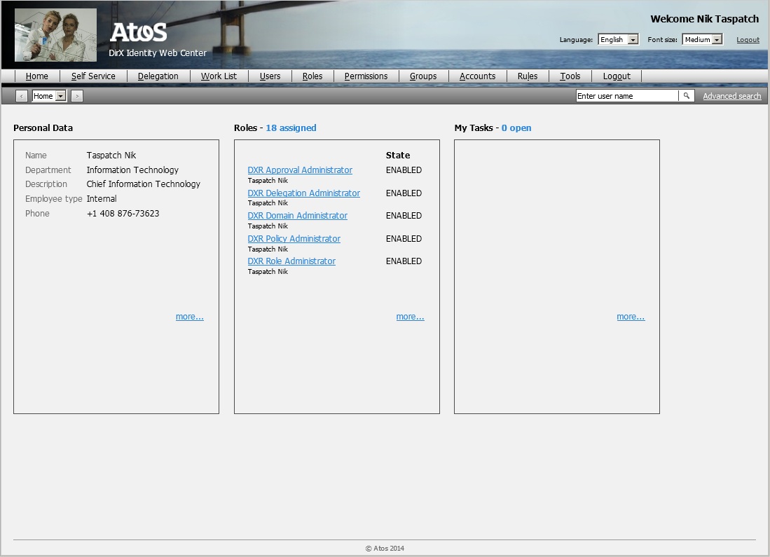
For performance reasons, each plug-in shows only a limited amount of data. The “more” link provides a quick link to the detailed property page or complete list. The title of plug-in lists also displays the total number of entries found.
Web Center provides plug-ins for
-
A property page with personal data of the logged-in user.
-
The roles assigned to the logged-in user.
-
The permissions assigned to the logged-in user.
-
The groups assigned to the logged-in user.
-
The accounts assigned to the logged-in user.
-
The logged-in user’s task list.
You can customize the provided plug-ins, and you can also define your own plug-ins.
Defining the Home Menu
The home menu is defined in file WEB-INF/config/identity/menu-defs.xml
<definition name=".menuHome" extends=".menu">
    <put name="msgPrefix" value="home"/>
    <put name="titleItem" value="home:/home.do:loginDN"/>
</definition>
The action invoked on clicking menu button “home” is “/home.do”. The action displays the home page.
The home menu is assigned as first menu to the default menu bar:
<definition name=".defaultMenubar">
<put name="items"
     value=".menuHome;sep;.menuSelfService;.menuDelegation;…”/>
</definition>
Displaying the Home Page after Login
By default, the home page is displayed after a user has logged-in.This is achieved by
-
Adding the menu item as first item to the start action list in file WEB-INF/config/identity/menu-defs.xml:
<definition name=".startActions"> <put name="items" value=".menuHome:home;.menuUserManagement:select;…"/> </definition> -
Adding a forward to action “/getStartAction” in file WEB-INF/config/identity/struts-config.xml:
<action path="/getStartAction" ...>
    <forward name=".menuHome:home" path="/home.do" redirect="true"/>
    …
</action>
Defining the Home Action
The home action is defined in file WEB-INF/config/identity/struts-config.xml.It just forwards to the Tiles definition “.home”.
<action path="/home"
        type="com.siemens.webMgr.controller.action.JSPAction"
        parameter="resetPoint:true;
                   history:true">
    <forward name="next" path=".home"/>
</action>
The “history” parameter is set to “true” in order to get home page requests added to the navigation history.
Defining the Home Page
The home page is defined in file WEB-INF/config/identity/tiles-defs.xml.It displays just a form content but no header text.
<definition name=".home" extends=".base">
    <put name="formContent" value=".homeForm"/>
</definition>
The form content is implemented by a special JSP. The JSP displays a page with a couple of frames that asynchronously load the plug-ins:
<definition name=".homeForm"
            path="/WEB-INF/jsp/view/tiles/plugInPage.jsp">
    <put name="pageId"  value="home"/>
    <put name="plugIns" value="…"/>
</definition>
The value of attribute “plugIns” is a semicolon-separated list of plug-in definitions.
A plug-in definition includes up to seven components, separated by colons.
-
The message key of the plug-in title. For list plug-ins, the key is also used as prefix for the message keys used to display the total number of entries found. The entire plug-in title is then composed of:
-
The plug-in title with message key “<titleKey>”, for example “Roles”.
-
A delimiter with message key “<titleKey>.delim”, for example “-”.
-
A prefix for the number of entries found with key “<titleKey>.prefix”.
-
The total number of entries found.
-
A suffix for the number of entries found with key “<titleKey>.suffix”, for example “assigned”.
-
-
The plug-in type, either “list” for list plug-ins or “properties” for property-page plug-ins.
-
The action displaying the plug-in (without leading slash).
-
The optional message key of the text for the “more…” link.
-
The optional action to be invoked on clicking the “more…” link. The action may include request parameters.
-
An optional comma-separated list of modifiers that control the visibility of the plug-in.
-
Use the predefined modifier “ps” for plug-ins to be visible only if the professional suite is installed.
-
Use the predefined modifier “bs” for plug-ins to be visible only if the business suite is installed.
-
Use modifier “<menu key>:<menu item>” for plug-ins to be visible only if the logged-in user is allowed to execute the corresponding menu item.
-
Any other modifier is ignored.
-
-
A focus priority. The plug-in with the highest priority gets the focus when the page is displayed.
The default plug-in list includes a property-page plug-in and two list plug-ins:
value="home.summary:properties:homeSummary.do:
            home.more:showMyUserData.do::4;
       home.groups:list:homeGroups.do:
            home.more:showMyUserData.do?
                               privilegeAction=showMyUserGroups.do:bs:2;
       home.roles:list:homeRoles.do:
            home.more:showMyUserData.do?
                               privilegeAction=showMyUserRoles.do:ps:0;
       home.tasks:list:homeTasks.do:
            home.more:showWorklist.do:ps,Worklist.taskList:5"
Property Plug-Ins
A property plug-in displays attributes of an entry.It supports one attribute per line.Each attribute has a label and one or more values.A value is truncated if it exceeds a maximum size.The complete value can be viewed as tooltip or by selecting the value and scrolling to its end.
The definition of a property plug-in consists of a form bean, a Struts action and a Tiles definition.The samples below can be found in folder WEB-INF/config/users/home.
Form Definition
The form bean lists the properties to be displayed.Special renderers are provided for labels and value.Define each value as read-only and on a separate line (y=”+1”).
Sample
<form-bean name="homeSummaryForm">
  <form-property-group name="homeSummary" groupRenderer="fieldSet"
                       label="home.summary">
    <form-property name="$displayName"
                   type="java.lang.String" readonly="true"
			 labelRenderer="plugInLabel" fieldRenderer="plugInText"
                   y="+1"/>
    <form-property name="dxrOULink@$displayName"
                   type="java.lang.String" readonly="true"
		        label="ldap.attribute.ou"
                   labelRenderer="plugInLabel" fieldRenderer="plugInText"
                   y="+1"/>
    <form-property name="description"
                   type="java.lang.String" readonly="true"
			 labelRenderer="plugInLabel" fieldRenderer="plugInText"
                   y="+1"/>
    <form-property name="employeeType"
                   type="java.lang.String" readonly="true"
			 labelRenderer="plugInLabel" fieldRenderer="plugInText"
                   y="+1"/>
    <form-property name="telephoneNumber"
                   type="java.lang.String" readonly="true"
			 labelRenderer="plugInLabel" fieldRenderer="plugInText"
                   y="+1"/>
  </form-property-group>
</form-bean>
Note that the form properties are enclosed in a form property group with field renderer “fieldSet”. The renderer has no visible effect. It just defines a general prefix (attribute “label”) that is used by accessibility tools to generate distinct names for the enclosed form properties.
Struts Action
The Struts action references the form bean of the property page plug-in and defines the bean scope; usually, scope “request” will do.
Parameter “jspPage” defines the JSP which reads the attributes from the database and assigns them to the form bean. JSP page showData.jsp evaluates the following additional parameters:
-
object – The DN of the entry whose attributes are to be displayed.
Action forward “tile” is mapped to the Tiles definition displaying the form.
Tiles Definition
The Tiles definition is derived from definition “.fragment” since it doesn’t generate a complete HTML page but just an HTML fragment. Attribute “formContent” refers to the Tiles definition generating the form. Since a plug-in usually doesn’t include a text header, attribute “textFile” is left unspecified.
The form is as usual generated by JSP file form.jsp. Attribute”action” references the action the form bean is assigned to. Attribute “styleClass” defines a CSS class which sets form margin and width.
Sample
<definition name=".homeSummary" extends=".fragment">
	<put name="formContent" value=".homeSummaryForm"/>
</definition>
<definition name=".homeSummaryForm"
            path="/WEB-INF/jsp/view/tiles/form.jsp">
	<put name="action"     value="/homeSummary.do"/>
	<put name="styleClass" value="plugInPropertyPage"/>
</definition>
List Plug-Ins
List plug-ins support lists with up to three properties per entry.The list has one or two columns.The first and third properties are displayed in one row in the first and second column, respectively.The second property is shown in the first column below the first property.
The first property is required, the others are optional.Headers are supported for the first and third property but not for the second one.
The sort order can be specified but the end user cannot re-sort the list.Default sort order is first property first, then the second and finally the third one.
An icon may be displayed in front of each entry.Clicking the icon or the value of the first property can trigger an action.For example, clicking a role in an “assigned roles” list will display the role’s summary page, while clicking a task in a task list will display the page to perform the task.The action might be available only to users having the access right to perform a corresponding menu item.
The samples below can be found in folder WEB-INF/config/users/home.
Form Definition
The form bean accepts just a single child element of type <form-property-list>. The form property list accepts up to three child elements of type <list-property>.
Form Property List
The <form-property-list> element supports the following attributes:
fieldRenderer – The reference to a renderer definition to be used for displaying the list. The renderer configuration file “renderers-config.xml” must contain an entry with this identifier. See the section "Renderers Configuration renderers-config.xml" in this chapter for details.
icon – The icon to be displayed alongside each list entry; a file name relative to folder resources/images.
iconTitle – The message key for the icon tooltip.
name – The list name. The name must be unique within the form.
openAction – The Struts action to be invoked when clicking on a list item. The action may be optionally followed by a menu key and item saying that the action is only enabled for users that have the corresponding menu access right. Sample: /openRole.do:RoleMgt.summary.
openDescription – The message key of a textual description of the open action. The description is used by accessibility tools to display or read a unique and meaningful text in order to let users invoke the open action in a different way. The expression {0} in the message text will be replaced with the actual list item name.
rendererProperties – A semicolon separated list of name/value pairs defining properties transparently passed to the list renderer. The properties can be referenced in HTML or Javascript code snippets. Property name and value must be separated by a colon. This is a convenient way to define custom renderer properties whose values vary with the property list. The property values accept expressions.
size – The number of entries to be displayed in the list. The preferred way is to specify the list size as a parameter of the corresponding Struts action.
sortIndexes – A comma-separated list of column indexes defining the sort order. Default is “0,1,2”.
List Property
The <list-property> element supports the following attributes:
cellRenderer – The renderer to be used for displaying the cell content of this column. This attribute must be a valid entry in the renderer configuration file renderers-config.xml.
label – The message key for the list column header. Since the first two properties are displayed in the same column, the label of the first property should describe both properties. The label of the second property is always ignored. Any resolved label ending with “:hidden” is not visible. Note that the label is also used by accessibility tools.
messagePrefix – A prefix for message keys related to this data property.
name – The name of the form property described by this element, most often the LDAP name of an attribute of the objects to be displayed. Required. You can make use of placeholder names such as “$displayName”, which are defined in the object description of the corresponding object.
rendererProperties – A semicolon separated list of name/value pairs defining properties transparently passed to the list property renderer. The properties can be referenced in HTML or Javascript code snippets. Property name and value must be separated by a colon. This is a convenient way to define custom renderer properties whose values vary with the list property. The property values accept expressions.
type – The fully-qualified Java class name of the field underlying this property, optionally followed by "[]" to indicate that the field is indexed. Required.
whiteSpace – The CSS property value that specifies how to handle white space in the values displayed in this column. Sample values are normal, pre and nowrap.
width – The width of the column. We recommend that you specify the width as a percentage of the total list width, since fixed values can lead to undesirable results in different screen resolutions. The width applies to the first and third list property only, defining the width of the first and second column, respectively.
Samples
Sample 1
The first example shows a list with a single property and no header.
<form-bean name="homePermissionsForm">
    <form-property-list name="assignedUserPermissions"
          openAction="/openPermission.do:PermissionMgt.summary"
          openDescription="home.permissions.openDescription">
        <list-property name="$displayName" width="100%"
                       label="home.permissions.header"/>
    </form-property-list>
</form-bean>
Sample 2
The example displays a list with a two properties; the second one is ignored. A header is displayed for the second column.
<form-bean name="homeGroupsForm">
    <form-property-list name="assignedGroups"
        openAction="/openGroup.do:GroupMgt.summary"
        openDescription="home.groups.openDescription">
        <list-property name="$displayName" width="90%"
              label="home.groups.header"/>
        <list-property name="skip_1"/>
        <list-property name="assign.displayState"
              label="ldap.attribute.dxrState"
              width="10%" cellRenderer="textState"/>
    </form-property-list>
</form-bean>
Sample 3
The example shows a list with a three properties and an icon. A header is displayed for the second column.
<form-bean name="homeTasksForm">
    <form-property-list name="workItems"
                        openAction="/openTask.do"
                        openDescription="home.tasks.openDescription"
                        icon="task.gif" iconTitle="home.tasks.iconTitle"
                        sortIndexes="2,0,1">
        <list-property name="actdisplayname" width="90%"
                       label="home.tasks.header"/>
        <list-property name="rdn_true_subject_dn"/>
        <list-property name="actexpirationtime" type="java.util.Date"
                       label="requestwf.worklist.expirationDate"
                       width="10%"/>
    </form-property-list>
</form-bean>
Struts Action
The Struts action references the form bean of the list plug-in and defines the bean scope; usually, scope “request” will do.
Parameter “jspPage” defines the JSP which reads the entries from the database and populates the form bean. Web Center provides the JSP page listEntries.jsp specifically for list plug-ins. The JSP searches for entries in the database but returns a single page of the total result only, together with the total number of entries found.
The JSP evaluates the following additional parameters:
-
elements – The name of the form-property-list element of the form bean to be populated. The name must be one of the following items:
-
workItems
-
assignedRoles
-
assignedPermissions
-
assignedGroups
-
assignedAccounts
-
-
indexOfFirstEntry – The index of the first entry in the page. The very first entry has index 1. Default: 1.
-
indexOfLastEntry – The index of the last entry in the page. The very first entry has index 1. Default: 5.
-
sortAttributes – Attributes for server-side sorting; a comma-separated list of LDAP attribute names. Each name may be followed by “:r” to indicate reverse ordering. Server-side sorting is supported for workItems only. For example, “dxrStartDate:r,dxrExpirationDate” sorts for start date in reversed order first, expiration data in regular order second.
Action forward “tile” is mapped to the Tiles definition displaying the form.
Sample
Usually the only attribute you might want to change for one of the standard list plug-ins is the index of the last entry to be displayed. To make adaptation easier, the index takes it value from an option in file webCenter.properties. Change the option there, and leave the Struts action definition untouched.
<action path="/homeTasks"
        type="com.siemens.webMgr.controller.action.JSPAction"
        name="homeTasksForm"
        scope="request"
        parameter="jspPage:/WEB-INF/jsp/controller/core/listEntries.jsp;
                   elements:workItems;
                   sortAttributes:dxrExpirationDate;
                   indexOfLastEntry:${webCenter.homeMaxNumberOfTasks}">
    <forward name="tile" path=".homeTasks"/>
</action>
Tiles Definition
The Tiles definition is derived from definition “.fragment” since it doesn’t generate a complete HTML page but just an HTML fragment. Attribute “formContent” refers to the Tiles definition generating the form. Since a plug-in usually doesn’t include a text header, attribute “textFile” is left unspecified.
The form is as usual generated by JSP file form.jsp. Attribute”action” references the action the form bean is assigned to. Attribute “styleClass” defines a CSS class which sets the form width.