User Interface
The DirX Corporate Directory application provides a user interface implemented by the Angular web framework.
The interface consists of these components:
Some of the functionality and look and feel of these components are configurable.
Core Functionality
Core functionality is provided by the DirX Web UI Core application, which can provide access to multiple applications from the DirX product suite. For the DirX Corporate Directory application, the DirX Web UI Core is preconfigured and provides access only to this application.
The core functionality consists of:
-
Application menu – Click on the Application menu icon located in the upper left corner to activate the menu.
The activated menu contains the following options:
-
Applications – Navigates to the home page listing available applications.
-
Settings – Navigates to the settings view where the current language setting and theme can be changed.
-
About – Opens a view with information about the application.
Other options are visible only if the user is logged in the application.
-
-
Breadcrumb navigation bar – A graphical control element that is used as a navigational aid in user interfaces and on web pages. It is the panel located under the application header and can be used for easier navigation in the application.

-
Application home page – The main view of the selected application.
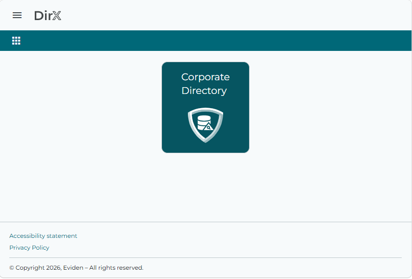
Login view
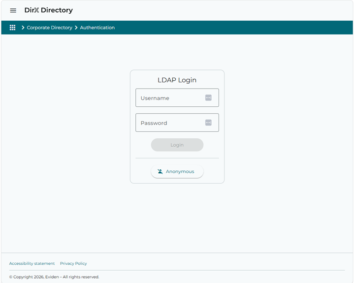
Click on the Corporate Directory tile to open the login view. It provides the form used for LDAP-based authentication. The form contains two input fields:
-
Username – The user’s DN.
-
Password – The user’s password.
To log in, use the Login button or press the Enter key on the keyboard. If the authentication process is successful, the application displays the search form.
Depending on the bind operation configuration, the form can also provide the Anonymous button, which allows the user to be authenticated as anonymous without providing a username and a password. See the section "Bind Operation" in "Configuration".
After a successful login, the user’s avatar is displayed in the upper right corner of the application header. The user can click on the button to open a menu with additional options. This menu contains the same options as the Application menu which is also expanded to include options for the logged-in user:
-
User identification – Displays the currently logged-in user.
-
Profile – Navigates to the user profile view.
-
Applications – Navigates to the home page.
-
Settings – Navigates to the settings view where the current language setting and theme can be changed.
-
Help – Opens the user interface documentation in a new tab.
-
About – Opens a view with information about the application.
-
Log out – This action logs out the current user.
Quick search
This component is used for quick LDAP searches according to one preconfigured attribute (Surname). The input field has its preconfigured search operator like begins, ends, contains and equals; user can change the operator from the predefined set. The default attribute and operator are configurable. See the section "Quick search" in "Configuration" for more details.
To perform the LDAP search, insert the search value and click the search button (the magnifying glass icon). The application then navigates to the Results table view where the search results are presented. The Entry details view is directly displayed if there is only one result entry.

Search
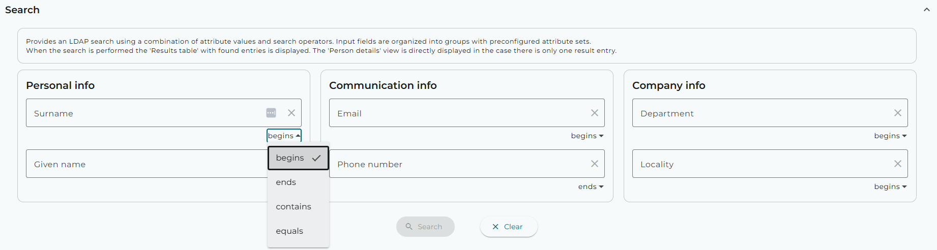
This component is used for an expert LDAP search using a combination of attribute values and search operators. The user interface consists of input fields organized in groups. The groups and their attribute sets are preconfigured via the application configuration file (Personal info, Communication info, Company info or other). See the section "Expert search" in "Configuration".
Each input field has its preconfigured search operator like begins, ends, contains and equals; user can change the operator from the predefined set. The default operator and the set of available operators is configurable.
Logical conjunction (and) is applied on all provided values in input fields. If no value is provided, the attribute is omitted from the LDAP search.
To perform the search, press the Enter key on the keyboard or click the Search button (the magnifying glass icon).
Click the Clear button to clear all the input fields.
Results table
The Results table view lists the entries that resulted from the LDAP search. The entries are presented in a table and paged and ordered according to the configuration. The last column contains the Show Details
 button which navigates to the Entry details view.
The column set, page size and ordering are configurable. See the section "Results table" in "Configuration".
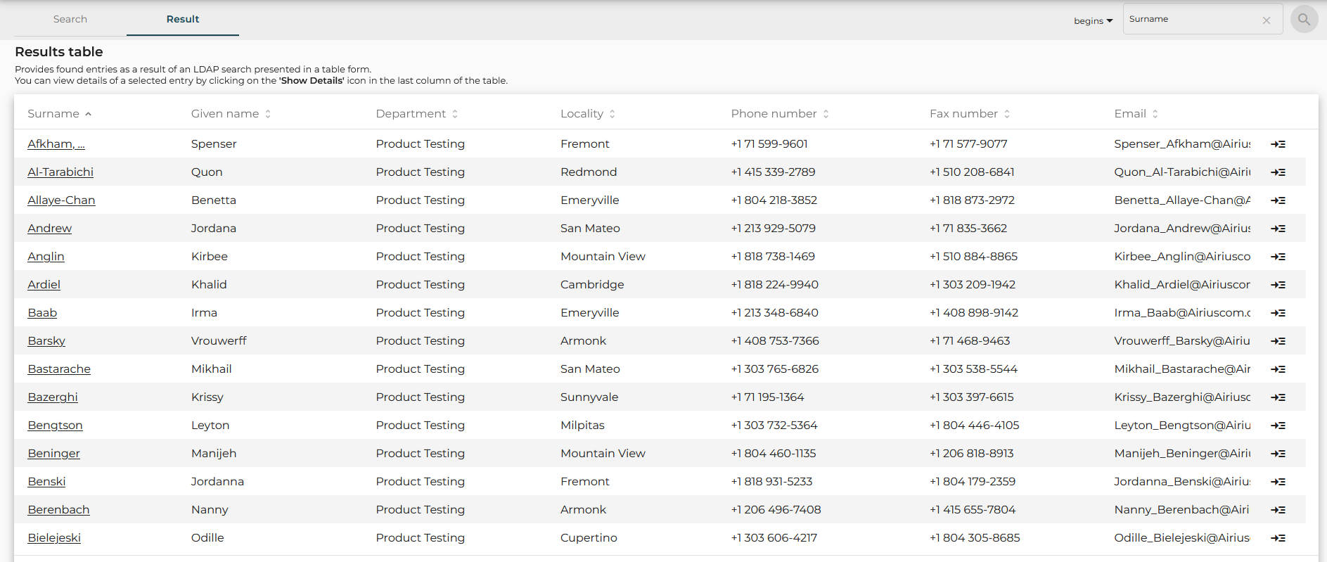
When the value is underlined, the configured action can be triggered by clicking on this value.
Information about an action is displayed in a tooltip (shown on a mouse hover).
The configured action can add the selected value to the search form for further search
or directly search for the entry by the searched DN and display it in the detail view.
See the section "Link" in "Configuration" for more details about configuration of link actions.

Entry details
The Entry details view represents detailed information on the searched entry. When the search returns only one entry, the application navigates directly to the Entry details view and skips the Results table view.
The view is organized in groups containing a set of fields and can be different for each entry type. Groups and their attribute sets are configurable via the application configuration file. The configuration can also be different for available entry types. See the section "Entry details" in "Configuration" for more details.
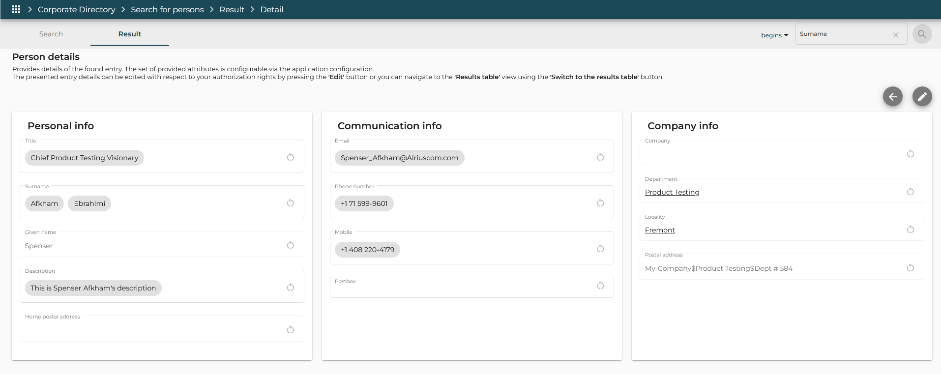
Click the Switch to results table  button to navigate back to the Results table view.
Click the Edit  button to switch the form to edit mode. The user must have sufficient access rights to save modifications of the entry in the directory.
Use the Save button to save changes to the form.
To revert to the initial state of the selected entry (before editing), click the Reset All button. Changes are discarded and edit mode is switched off.
Entry details views can be attached to the separate tabs next to the Search for quick access.
To add currently searched entry details to the new tab use the Open in Tab
 button.
You can also add the entry details view to the separate tab directly from the Results table view by right-clicking the Show details button in the last column of the searched entry.
To remove a Entry details tab click the Close button.

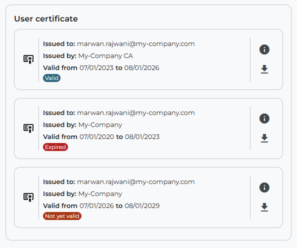
If the configuration of detail view contains the attribute of certificate type, the user can view the certificate information in the Entry details view.
Each certificate is represented by a card containing basic information about the certificate such as Issued to, Issued by, Valid from, Valid to, and status. The status of the certificate is determined in terms of validity period.
Possible status values are:
-
Valid – The certificate is valid.
-
Expired – The certificate is expired.
-
Not yet valid – The certificate has not yet been valid.
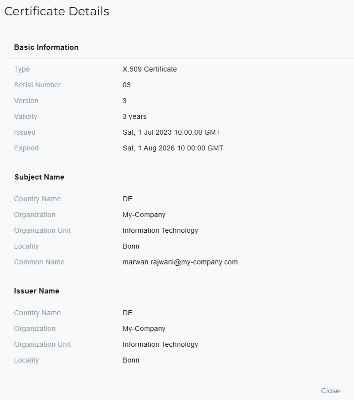
The user can click the Show certificate details button to view complete information about the certificate such as subject , issuer, extensions. The user can also download the certificate by clicking the Download certificate button.
If the form is in edit mode and the user has sufficient access rights to save modifications than the user can also delete the certificate by clicking the Delete certificate button or import a new certificate.
If attribute contains multiple values, all available entries are displayed, including any invalid certificates.