User Interface Configuration
Web Center applications are based on Struts. Customizing an application basically means customizing the Struts configuration files delivered with the standard Web Center applications. Since the files are subject to changes due to new features or bug fixes, upgrading a customization from one DirX Identity version to another one is usually a non-trivial task. The list of configuration files described in this chapter comprises:
-
Struts configuration struts-config.xml
-
Tiles configuration tiles-defs.xml
-
Menu configuration menu-defs.xml
-
Forms configuration forms-config.xml and converters.properties
-
Renderer configuration renderers-config.xml and defaultRenderers.properties
-
Object configuration objects-config.xml
-
Validator configuration
The list of configuration files used by a specific application must be defined in the application’s context descriptor; see chapter "Configuration Files" for details.
Struts Configuration struts-config.xml
The struts configuration file is the "heart" of the Web application and contains all necessary data to set up and run it.It specifies the action servlet, the form beans, action mappings and a number of plug-ins for template handling, validation, rendering and others.For an introduction to Struts configuration see the Struts documentation at http://struts.apache.org.
This section covers only the Web Center-specific Struts configuration information.
Form Beans
Each form referenced by the name attribute of an <action> element in this file must be declared or defined in the <form-beans> section.
A form declaration is a <form-bean> sub element specifying just form name and type, but no properties.The form must then be defined in a separate forms configuration file.Externally defined forms can be referenced from within several struts configuration files.
A form definition additionally lists the form’s properties in <form-property> sub elements. A form directly defined in a struts-config.xml file cannot be referenced from within other files.
Forms of type com.siemens.webMgr.model.DynaLocaleForm must be defined externally. We recommend just to declare each form here, and to define it externally. For more details, see the chapter on forms configuration below.
Important attributes of the <form-bean> element are:
name – The unique identifier of the form. This value is used in the “name” attribute of <action> elements to reference the form.
type – The class name. Usually org.apache.struts.action.DynaActionForm or com.siemens.webMgr.model.DynaLocaleForm,
Action Mappings
Action mappings are defined in <action> elements within a <action-mappings> parent. Each <action> element maps a module-relative URI to an action class that processes the request. The following attributes are important:
path - The requested URI.
type – The class name of the action. Web Center always uses the same action handler and delegates request specific tasks to the “controller JSP page”.
name – The name of the form bean to be used in this action. It references a <form-bean> element (see the section "Form Beans" in this chapter).
parameter – A general-purpose parameter used to pass extra information to the action handler and the controller JSP page. It contains a list of name-value pairs separated by ‘;’. Any leading and trailing white spaces around parameter names and values are discarded. The first and most important parameter is “jspPage”, which denotes the “controller JSP”. The action handler copies all other parameters into the request attributes and processes the JSP page. Thus, the “controller JSP” only evaluates the other parameters and their usage should be studied there. But there are some parameters used very often:
jspPage – The relative path of the “controller JSP” page.
object – The “main” object of this action, typically the object to be displayed or edited. For example, this will be the login user in self-service requests or the role going to be modified. The JSTL notation references the object by its attribute name in the session context, for example ${sessionScope['com.siemens.webMgr.selectedUser']}.
operation – The requested operation, for example “modify”. The operation is particularly important in case the action is triggered via a context menu. In that case, Web Center executes the action only if the logged in user has the access rights to perform the operation on the main object.
defaultSearchBase – The search base for LDAP search operations, especially used for requests to list users, roles or other objects.
elements – The object type to be searched for or a list of attributes in list operations, for example users, juniorRoles, roles.
resetPoint – A reset point (true) is an action to which the application can safely redirect to after processing a request to change the language or the font size. A reset point action must not perform any changes in the database, and should not rely on a specific session state.
history – Whether to include the action in the navigation history or not.
historyLabel – The message key of the label for the action’s navigation history entry. The default message key is navigationHistory.<actionPath>.
Each <action> element typically has a number of <forward> sub-elements. The action handler and in the Web Center case most often the “controller JSP” returns a forward value. The Struts framework forwards the navigation flow to the path of the matching <forward> element. There are two different path types. A path starting with a dot names a tiles definition and instructs the controller to build the HTTP response according to that definition; see the section "Tiles Definitions tiles-defs.xml" in this chapter for details. A path starting with a slash, on the other hand, identifies a Struts action and causes page execution to be continued with that action.
Plug-ins
External plug-in resources can extend the Struts framework. Standard ones are the Tiles framework and a validator. Web Center also includes them and adds its own extensions.
The Web Center extensions are plug-ins for form, renderer and object configurations. Each is configured separately in a <plug-in> element like the following one for the form configuration:
<plug-in className="com.siemens.webMgr.config.FormConfigPlugIn"/>
The standard plug-ins support proprietary properties. Important are the ones where the definition files are listed.
You set the Tiles definition files in the property definitions-config as in the following sample snippet:
<plug-in className="org.apache.struts.tiles.TilesPlugin">
    <set-property property="moduleAware" value="true"/>
    <set-property property="definitions-parser-validate" value="true"/>
</plug-in>
In order to modularize the configuration, Web Center uses a tiles-definition file per module (identity and user management, workflows, role management, and so on). To allow Tiles to support this configuration, you must set the property moduleAware to true.
The Struts validator is registered with the following configuration:
<plug-in className="org.apache.struts.validator.ValidatorPlugIn">
    <set-property property="pathnames"
        value="/WEB-INF/config/validator-rules.xml,
               /WEB-INF/config/validation.xml"/>
</plug-in>
The property pathna
The property pathnames lists the validator configuration files.The validator plug-in is required since Web Center forms subclass the Struts class DynaValidatorActionForm.
Tiles Definitions tiles-defs.xml
The Tiles framework allows assembling presentation pages from component parts.Each part ("Tile") can be reused as often as needed throughout the application.This re-use reduces the amount of markup that needs to be maintained and makes it easier to change the look and feel of a website.
The tiles are defined in configuration files tiles-defs.xml.The root element <tiles-definitions> contains a number of <definition> elements.Each of them describes a tile that can be inserted in a JSP page.Definitions provide an inheritance mechanism: a definition can extend another one and override some (or all) of its attributes.
Element <definition>
A <definition> can define a template or a "tile".If it defines a template (or form), its “path” attribute will point to a JSP page that contains the layout of the template.If it defines a tile (or sheet), it refers to a named portion of a page or to a reusable component.
Definitions set attributes for a tile as <put> tags (see the section "Element <put>" in this chapter).
The following list shows the attributes of the <definition> element used in Web Center:
name – The unique identifier for this definition. By Web Center convention, this name should start with a period (".") to avoid naming conflicts with Struts configuration.
extends – The name of a definition that is used as the ancestor of this definition. All attributes from the ancestor are available to the new definition. Any attribute inherited from the ancestor can be overloaded by providing a new value.
path - The context-relative path to the resource used as the tile to insert. This tile will be inserted and a tiles context containing appropriate attributes will be available.
Element <put>
The <put> element is a child of a <definition> and describes an attribute of a definition. Its most important attributes are:
name – The unique identifier of the attribute to be set or replaced in the ancestor.
value – The value associated with this attribute.
Important <put> tags are:
action – The URL of the struts action to be performed when this form is submitted (for forms).
styleClass - The name of the CSS style class to be used for this form.
Web Center Base Page Definition
All JSP pages used by Web Center have a common basic tiles definition that is used to construct the final HTML page by a set of page tiles. The basic layout template is stored in jsp/view/forms/layoutPage.jsp.
The following picture gives an overview of the page areas. The content of the shaded areas is defined in separate JSP files that are included via <tiles:insert> or <c:import>.
| Key visual ( or Key visual + Site identifier) | Company logo | Application title |
|---|---|---|
Login status and options |
||
Navigation bar |
||
Content area |
||
Footer |
||
[Debug area] |
The layout template contains the following areas:
-
Key visual – The picture displayed in the top left corner of the page, and a text displayed on top of the picture.
An alternative way is to split the key visual in two part, top and bottom:
-
Key visual – The upper part of the picture displayed in the top left corner of the page.
-
Site identifier – The bottom part of the top left picture, overlaid with a text; a tile implemented by the JSP jsp/view/tiles/siteIdentifier.jsp.
-
Company logo – The company logo
-
Application title – The application’s title.
-
Login status and options – The user’s login status, the logout link and option combo boxes; a tile implemented by the JSP jsp/view/tiles/subHeaderLeft.jsp.
-
Navigation bar – The application’s navigation bar which is generated by the <view:menu> tag.The navigation bar may as well be placed on the left beneath the key visual.
-
Content area – The application’s main content area; the JSP code is imported from jsp/view/forms/layoutContentArea.jsp.
-
Footer – DirX Identity version and build number, copyright, and package (Business or Professional Suite); a tile implemented by the JSP jsp/view/tiles/footer.jsp.
-
Debug area – Debug output area; for development purposes only.
Changing the basic layout template may be a time-consuming task, since the entire body is an HTML table with partial percentage heights and widths.Removing an item may cause the page to be displayed incorrectly.Use an HTML analog and try the changes in an HTML editor before making any layout template modification.
Menu Configuration menu-defs.xml
The menu configuration defines the menus and items for the navigation bar of a Web Center application, as well as context menus for various tables displaying entry or attribute lists.
The configuration file menu-defs.xml is a regular Tiles definitions file, registered as usual as plug-in in the main struts-config.xml file.
Menu Selectors
Menu selectors are flags that control the visibility of menu items.For example, some menu items are visible only if the Professional Suite is installed.Each flag has a name; its value defines the conditions under which it is true.
Menu Selectors
The menu selector list is a tiles <definition> element. Each of its attributes defines a menu selector. Attribute name is the menu selector identifier, attribute value is the condition under which the selector applies. A value usually is an expression which may use variables from application scope and evaluate the installed packages via the special variable “packages”.
Sample
<definition name=”.menuSelectors”>
    <put name="bs"
            value="${packages.Business and not packages.Professional}"/>
    <put name="ps"    value="${packages.Professional}"/>
    <put name="pwdId" value="${webCenter.passwordMode == 'identity'}"/>
    <put name="notFunctionalUser" value="${not apply.isFunctionalUser
            [sessionScope['com.siemens.webMgr.selectedUser']]}"/>
    <put name="runningWorkflow"   value="${not apply.isFinished
            [sessionScope['com.siemens.webMgr.selectedWorkflowItem']]}"/>
</definition>
The section defines three menu selectors. The selector with name “bs” applies if the Business Suite is installed but not the Professional Suite. The second selector applies if the Professional Suite is installed. And the third one applies if the password mode is set to “identity” in file webCenter.properties.
The last two selectors use the apply object defined in JSP page controller/utils/initSession.jsp.The JSP defines the pseudo-methods isFunctionalUser and isFinished which are applied here to the selected user and the selected workflow item, respectively.
Menus
The menus to be displayed in a navigation bar are described by a single menu bar definition. A menu bar is a list of menus, each menu a list of menu items.
Menu Bar
A menu bar is a tiles <definition> element with attributes name and items.
name
The menu bar name is defined by the name attribute of the tiles definition. The name is referenced by <view:menu> tags in view JSPs.
items
The semicolon-separated list of menu names. The navigation bar displays the menu titles in the same order as listed here.
The special name sep is intended to indicate the start of a new group of related menus; the adjacent titles will be visually separated (for example by a wider gap).
Any leading and trailing white spaces around names are discarded.
Sample
The following menu bar with name “.defaultMenubar” displays four menus, menu access policies permitting:
<definition name=”.defaultMenubar”>
<put name=”items” value=”.menuSelfService;.menuDelegation;sep;
.menuUserManagement;sep;.menuTools”/>
</definition>
The second menu title will be visually separated from the third one by a somewhat wider gap.
Menu
A menu is a tiles <definition> element with attributes name, accessPolicyKey, selectors, msgPrefix, title, titleItem and items.
name
The menu name is defined by the name attribute of the tiles definition. The name is referenced by menu bar definitions.
accessPolicyKey
The menu key for the menu. The key is used to check whether the logged in user has the proper menu access rights. If not, the menu is not displayed in the navigation bar. The list of available keys is stored in the directory node “cn=Keys,cn=Menus,cn=Proposal Lists,cn=Configuration,cn=domain”.
selectors
A comma-separated list of predefined values controlling whether the menu is displayed or not.
-
ps – Skip the menu if the DirX Identity Professional Suite is not installed.
-
bs – Skip the menu if the DirX Identity Business Suite is not installed.
-
pwdId – Skip the menu if Web Center runs with a password management mode other than identity.
Any other selector is ignored.
title
The message key suffix for the menu title. The entire message key is the concatenation of msgPrefix and title, separated by a dot.
titleItem
A menu may consist of its title, associated with an action. Clicking the title will then not pop up a list of menu items but activate the action. A sample use case is a logout menu. The value of attribute titleItem specifies the action as a single menu item.
items
The semicolon-separated list of menu items. When the menu is opened, the navigation bar displays its items in the same order as listed here.
The special item sep is intended to indicate the start of a new subgroup of related menu items; the adjacent items will be visually separated (eg by a horizontal line).
The special item nl indicates the start of a new menu row. Web Center supports one or two rows for horizontal menus. The item is ignored for vertical menus.
Any white space leading or trailing an item is discarded.
Sample
The following menu with name “.menuDelegation” displays three menu items, menu access policies permitting:
<definition name=".menu">
  <put name="title" value="title"/>
</definition>
<definition name=".menuDelegation" extends=".menu">
  <put name="accessPolicyKey"	value="Delegation"/>
  <put name="selectors"		value="ps,pwdId"/>
  <put name="msgPrefix"		value="delegation"/>
  <put name="items" value="
      showRights:/getDelegationsActive.do;
      delegateRights:/getDelegationsToDelegate.do;
      showDelegatedRights:/getDelegationsGranted.do"/>
</definition>
The attribute title is inherited from the base definition. The title message key is “delegation.title”.
The menu is shown only if the DirX Identity Professional Suite is installed, and if Web Center’s password management mode is identity.
Menu Item
A menu item definition is a string including a label, an action, a session variable, selectors and an access policy operation types. The different sections are separated by colons.
Label and action are required; session variable and selectors are optional.
label
The message key suffix for the menu item label. The entire message key is the concatenation of the menu’s msgPrefix and label, separated by a dot.
The label is also used to check whether the logged in user has the proper access rights to the menu item. Therefore, the label must match one of the items stored in the directory node “cn=Items,cn=Menus,cn=Proposal Lists,cn=Configuration,cn=domain”. If access is denied, the item is not displayed if the menu is opened.
action
The Struts action URI to be requested on clicking the menu item. The placeholder ${language} is replaced with the user’s actual language (like “en” or “de”) at runtime.
session variable
The suffix of the name of a session variable. The variable suffix is automatically prefixed by “com.siemens.webMgr.” before the variable is evaluated. The menu item is skipped if the session variable is not found or if it has an empty value. Otherwise, the value is used to replace a placeholder in the item label.
This attribute can for example be used for menu items to be displayed only if an entry like a user or role is selected, or if a search filter from a previous search is available.
selectors
A comma-separated list of predefined values controlling whether the menu item is displayed or not.
-
ps – Skip the menu item if the DirX Identity Professional Suite is not installed.
-
bs – Skip the menu item if the DirX Identity Business Suite is not installed.
-
pwdId – Skip the menu item if Web Center runs with a password management mode other than identity.
-
mod – Skip the menu item if the logged in user is not allowed to modify the selected entry referenced by the session variable.
-
Any other selector (except confirm) – Skip the menu item if the value of the session variable with name “com.siemens.webMgr.<selector>” is “true”. If the selector is followed by .inactive, the menu item is displayed but not selectable.
There are a couple of additional selectors serving a totally different purpose:
-
confirm – Indicates that the user has to confirm selection of the menu item, for example before deleting some entries. The key for the confirmation message text is the concatenation of the label key and the suffix “.confirm”. The default selection box button is “No”.
-
confirm.yes – Like confirm, but the default button is “Yes”.
-
dueDate.operation – Indicates that the operation supports the due date control for scheduled change management. Assign one of the due date flags in file webCenter.properties. If the flag is enabled, the due date control will be displayed.
-
updatePage – Update the entire HTML page on selection of the menu item, don’t just refresh the main content area via AJAX.
-
targetName – The name of the window in which to display the response to the request resulting from clicking the menu item.
-
targetType – The identifier of the window properties configuration. The identifier is the name of a field in object config.params.target in file resources/build/config/config.js.
access policy operation types
A comma-separated list of access policy operation types from enumeration Users.Operation. The menu item is skipped if the logged-in user doesn’t have the corresponding access rights on the object referenced by the above session variable.
Sample
The following menu displays three menu items, menu access policies permitting:
<definition name=".menuAccountManagement" extends=".menu">
  <put name="accessPolicyKey"	value="AccountMgt"/>
  <put name="selectors"		value="ps,pwdId"/>
  <put name="msgPrefix"		value="accounts"/>
  <put name="items" value="
      select:/getAccounts.do;
      sep;
      summary:/showAccountData.do:selectedAccount;
      delete:/deleteAccount.do:selectedAccount:
      privilegedAccount,confirm"/>
</definition>
A horizontal line will be drawn between the first and second item.
The message keys for the item labels are “accounts.select”, “accounts.summary” and “accounts.delete”,
The items “summary” and “delete” are displayed only if an account is selected (since only in that case the selected account’s DN is stored in the session variable “com.siemens.webMgr.selectedAccount”).
The item “delete” is displayed only if the selected account is privileged (since only in that case the session variable “com.siemens.webMgr.privilegedAccount” is set to “true”).
The deletion of the selected account must be confirmed. The key for the confirmation message is “accounts.delete.confirm”.
Context Menus
The context menu for one or more tables is described by a single context menu definition. A context menu definition includes a list of context menu items.
Context Menu
A context menu is a tiles <definition> element with attributes name, accessPolicyKey, action, msgPrefix and items.
name
The context menu name is defined by the name attribute of the tiles definition. The name is referenced from <form-property> elements defining tables within forms-config.xml files. The name must start with a dot.
accessPolicyKey
The menu key for the context menu. The key is used to check whether the logged in user has the proper access rights to the menu. If not, the context menu will not be displayed. The list of available keys is stored in the directory node “cn=Keys,cn=Menus,cn=Proposal Lists,cn=Configuration,cn=domain”.
action
The Struts action to be executed on clicking one of the context menu items. The default action is the context menu name without leading dot, followed by “*.do”.
For context menus on report lists, the action must have the value “.”. Do not use that value in other cases.
items
The semicolon-separated list of context menu items. When the context menu is opened, the items are displayed in the same order as listed here.
The special item sep is intended to indicate the start of a new subgroup of related menu items; the adjacent items will be visually separated (for example by a horizontal line).
Any white space leading or trailing an item is discarded.
Context Menu Item
A context menu item definition is a string including a label, modifiers like a confirmation message suffix and a due date flag, and the selection flags, separated by colons. The label is required, while the other parameters are optional.
contextMenuItem := label:modifiersAndSelectors:selectionFlags
label
A label definition consists of a message key suffix for the menu item label and an optional access right item, separated by a comma. If the access right item is missing, it is assumed to have the same value as the message key suffix.
The label message key is the concatenation of the context menu’s msgPrefix and the message key suffix, separated by a dot.
The access right item is used to check whether the logged in user has the proper access rights to the menu item. Therefore, it must match one of the items stored in the directory node “cn=Items,cn=Menus,cn=Proposal Lists,cn=Configuration,cn=domain”. If access is denied, the menu item is not displayed in the context menu.
On selection of the menu item, the label is forwarded to the respective Struts action in the HTTP parameter named forward.
The special label ms (multiple selections) indicates the start of the second menu section, which contains the items that apply to all selected entries. The message key for the section header is the concatenation of msgPrefix and ms, separated by a dot.
The special label list indicates the start of the third menu section containing the items to be applied to the entire list. The message key for the section header is the concatenation of msgPrefix and list, separated by a dot.
modifiersAndSelectors
Comprises flags to adjust the item’s functionality and selectors to control the item’s visibility and selectability. The flags and selectors are separated by commas:
modifiersAndSelectors = confirm,dueDate,sessionVariable
All flags and selectors are optional. When a selector is suffixed by “.inactive”, the item is displayed in the menu but not selectable. Otherwise, the item will not appear in the menu at all.
confirm
Indicates that the user must confirm selection of the menu item; for example before deleting some entries. The key for the confirmation message text is the concatenation of the label key and confirm, separated by a dot. By default, the selected button on the confirmation page is “no”. To select “yes” as the default, append .yes to the key.
dueDate
Indicates that the operation supports the due date control for scheduled change management. Assign one of the due date flags in file webCenter.properties. If the flag is enabled, the due date control will be displayed.
sessionVariable
The suffix of the name of a session variable. The variable suffix is automatically prefixed by com.siemens.webMgr. before the variable is evaluated. The menu item is skipped if the session variable is not found or if it has an empty value. Otherwise, the value is used to replace a placeholder in the item label.
This attribute can be used, for example, for menu items to be displayed only if an entry like a user or role is selected, or if a search filter from a previous search is available.
selectionFlags
A menu item may be applicable only to entries that meet some specific conditions. The menu item “approve” in a user’s task list, for example, is applicable only to approval tasks, and only to those tasks that do not violate SoD. The possible conditions are defined in the contextMenuFlags attribute of the table’s form bean definition; each condition is assigned an identifier. The value of selectionFlags lists the identifiers of the conditions to be met for this menu item.
Sample
The following context menu with name “.contextMenuRoles” displays five menu items, menu access policies permitting:
<definition name=".contextMenuRoles">
    <put name="accessPolicyKey"	value="RoleMgt"/>
    <put name="msgPrefix"		value="ctx.objects"/>
    <put name="items"
       value="summary;modify;sep;runReport;
                   ms:delete:confirm.roles,dueDate.delete;list;export"/>
</definition>
The first section has three items named summary, modify and runReport. The message key for the section header is “ctx.objects.entry”. A horizontal line will be drawn between the second and third item. The items are applied to the highlighted entry only. Their label keys are “ctx.objects.summary”, “ctx.objects.modify” and “ctx.objects.runReport”, respectively.
The second section has one item named delete. The message key for the section header is “ctx.objects.ms”. The delete item is applied to all selected entries. Its label key is “ctx.objects. delete”, Its selection must be confirmed. The confirmation message key is “ctx.objects.delete.confirm.roles”. The delete confirmation form will include the due date control if the flag dueDate.delete is enabled in webCenter.properties.
The third section has one item named export. The message key for the section header is “ctx.objects.list”. The export item is applied to the entire list. Its label key is “ctx.objects.export”,
Form Toolbars
A form toolbar defines a list of menu items to be visible in the toolbar above a form. The toolbar definition name is referred to in the Tiles definitions displaying the corresponding forms. The toolbar references a menu definition and specifies a list of menu items from that definition. Menu item selectors and menu access policies apply to each toolbar item as in the menu itself.
Form Toolbar
A form toolbar is a tiles <definition> element with attributes name, menu and items.
name
The toolbar name is defined by the name attribute of the tiles definition. The name is referenced from Tiles definitions from within tiles-defs.xml files.
items
The semicolon-separated list of menu items. The toolbar displays the items in the same order as listed here.
A toolbar item may define an alias name for a menu item. The alias name is used when searching for the tool’s icon, label and tooltip. The syntax is “<alias>:<menu item>”.
An item may optionally be followed by one or more parameters that are transparently passed as HTTP request parameters to the server when the tool is selected: “<alias>:<menu item>:<params>”. As usual, separate parameters by ampersands.
Any white space leading or trailing an item is discarded.
Sample
<definition name=".toolbarSelf">
    <put name="menu" value=".menuSelfService"/>
    <put name="items"
            value="refresh:summary:history=false;modify;changePassword "/>
</definition>
The toolbar displays icons for the summary, modify and change password items of the Self-Service menu. The summary item is visualized as refresh and does not lead to an additional navigation history item.
List Toolbars
A list toolbar defines a list of context menu items to be visible in the toolbar above a list. The toolbar definition name is referred to in the Tiles definitions displaying the corresponding lists. The toolbar references a context menu definition and specifies a list of context menu items from that definition. Menu item selectors and menu access policies apply to each toolbar item as in the menu itself.
Note that tools are applied to entire entry lists. Therefore, the only context menu items suited out of the box for toolbars are those in context menu section “list”. Other context menu items usually require implementation of specific actions.
List Toolbar
A list toolbar is a tiles <definition> element with attributes name, menu and items.
name
The toolbar name is defined by the name attribute of the tiles definition. The name is referenced from Tiles definitions from within tiles-defs.xml files.
items
The semicolon-separated list of context menu items. The toolbar displays the items in the same order as listed here.
A toolbar item may define an alias name for a context menu item. The alias name is used when searching for the tool’s icon, label and tooltip. It is also the name of the forward the respective context menu action passes the request to. The syntax is “<alias>:<context menu item>”.
Any white space leading or trailing an item is discarded.
Sample
<definition name=".toolbarRoles">
    <put name="menu" value=".contextMenuRoles"/>
    <put name="items" value="deleteList:delete;runReportOnList;export"/>
</definition>
The toolbar displays icons for delete, run report and export list. The item “delete” is usually not applicable to entire lists. Therefore, it is assigned the alias “deleteList”. The respective context menu action “/contextMenuRoles.do” will then pass request processing to the action assigned to forward “deleteList”.
Start Actions
Start actions define the first page displayed to a user after a successful login. You could define a fixed page like the user search page, but this is an appropriate choice only if the user is allowed to read other user’s entries, and to select menu items on them.
After a successful login, therefore, Web Center forward to the Struts action getStartPage.do. The action handler searches for the first menu item in the start action list the user is allowed to perform, and forwards that item provided the item matches any of the action’s defined forwards. If no suitable item is found, the handler forwards “default”.
Start Actions
A context menu is a tiles <definition> element with attributes name and items.
items
A semicolon-separated list of menu items. Each menu item is given by the name of its menu, followed by the item’s label. Name and label are separated by a colon.
Sample
<definition name=".startActions">
  <put name="items"
      value=".menuUserManagement:select;.menuSelfService:summary”/>
</definition>
The corresponding definition of getStartPage.do (in a struts-config.xml) is
<action path="/getStartAction" ...>
  <forward name=".menuSelfService:summary"
      path="/showMyUserData.do" redirect="true"/>
  <forward name="default"
      path="/getUsers.do" redirect="true"/>
</action>
If the user is allowed access to the item “select” in menu “.menuUserManagement“, she will get the user search page (getUsers.do).Since forward “.menuUserManagement:select” is left undefined, the “default” forward applies.
Otherwise, if the user is allowed access to the item “summary” in menu “.menuSelfService“, she will see her own entry (showMyUserData.do).
Otherwise, she will get the user search page (getUsers.do).
Forms Configuration forms-config.xml
Web Center throughout uses dynamic Struts forms of class org.apache.struts.action.DynaActionForm or a subclass thereof.
A dynamic form must be configured in a <form-bean> element, listing its properties in <form-property> sub elements.But there is no need to provide an extra Java Bean class with getters and setters for each of its properties.
The forms configured in a forms-config.xml file can be referenced from within one or more struts-config.xml files.Forms of class DynaActionForm can be defined in a struts-config.xml file as well, but then they cannot be referenced from within other struts-config.xml files.Therefore we recommend defining each form in a forms-config.xml file.Forms of the Web Center specific subclass com.siemens.webMgr.model.DynaLocaleForm must be defined in a forms configuration file since they support additional attributes.
The root element <forms-config> contains the child <form-beans>, which in turn contains a list of <form-bean> definitions.The latter two elements extend the XML DTD defined in Struts.
Expressions
Most attributes in a form bean configuration do not accept expressions.
Some attributes support expressions with the full range of variables scopes: page, request, session and application. These attributes are marked with “Accepts expressions”.
visible="${requestScope.visible}"
visible="${sessionScope['com.siemens.webMgr.accessibility'] == ‘readWrite’}"
And finally, some attributes support expressions with variable scopes limited to the form itself and to session and application scope. These attributes are marked with “Accepts form expressions”.
readonly="${sessionScope['com.siemens.webMgr.language'] == 'de'}"
readonly="${applicationScope['com.siemens.webMgr.licenses'].metarole}"
readonly="${modificationForm.map.employeeType != 'Internal'}"
Note that the third sample may be used within the definition of the form bean with name “modificationForm” only.
Making the visibility or alterability of a form property dependent on another form property may have undesired effects if the end user is allowed to modify the master property. If, for example, the employee number is visible only if employee type is “Internal” and the user changes the type to “Customer”, the employee number will no longer be visible on a possible re-display of the page even if the change has not yet been saved to the database in between.
Form Beans
A <form-bean> element describes a generic form, which – in Web Center – is the content of a tile.
The form is populated with form widgets. They are configured in <form-property> elements. A widget has a text label and is usually related to an LDAP or other Bean attribute. It may be editable or read-only.
A table defines the form layout with a row index running from top to bottom and a column index running from left to right. The widgets may be grouped to form groups. The row- and column indices of such a group are related to the group origin, so they start with index 0. They do not interfere with indices from outside the form group.
The widget’s HTML code is inserted into the form by a “renderer”. Each widget is related to a data type, which is specified as a Java class. The data types used in Web Center have a default renderer that may be overwritten by a special field renderer for each individual widget.
The Java implementation class for a form bean derives from the org.apache.struts.action.ActionForm class. Nearly all form beans in Web Center are realized by the class com.siemens.webMgr.model.DynaLocaleForm.
Form beans and their classes are referenced by <form-bean> and <action> elements in struts-config.xml.
The following attributes are important:
name – The unique identifier for this form bean. Referenced by the <action> element in the Struts configuration to specify which form bean to use with its request. Required.
buttons – A sequence of buttonType:labelKey where buttonType must be the identifier of a button renderer configured in renderers-config.xml (submit, reset, cancel etc.) and labelKey the key for the button label. The items are separated by a ";". The attribute is also used to configure whether the form includes the due date control. To enable the control, add the name of the respective due date flag in webCenter.properties as first element to the button list. If you enable the flag, the form will include the due date control. Accepts expressions.
buttonGap – The distance (in pixels) between the bottom-most form property row and the submit buttons; default is 10.
A <form-bean> element can contain any number of the following sub-elements: <form-property>, <form-property-group>, <form-include>, <form-import>. The form bean may also contain a single <form-body> element.
A <form-bean> element may also consist of an only sub-element of type <form-property-list>.
Form Body
The <form-body> element is intended to specify the location of the assignment panel (including the search panel) in an assignment form. Additional form properties may be placed above the assignment panel, or between assignment and button bar, or even to the left or right of the assignment panel.
The assignment properties of assignment forms are usually populated in file assignObjects.jsp. Other form properties are simply ignored. If you set the parameter “populateAdditionalFormFields” of the assignment action (in struts-config.xml) to “true”, however, the JSP will also fill all other form properties with values from the current object.
Sample
The sample form displays surname and given name in the same line above the assignment panel, and manager between the panel and the button bar:
<form-bean name="assignRolesForm" buttons="...">
  <form-property name="sn" y="0" …/>
  <form-property name="givenName" x="2" …/>
  <form-body y="+1" spanX="4">
    <form-property name="parameters" ...>
    <form-property name="availableRoles" ...>
    </form-property>
    <form-property name="assignedRoles" ...>
    </form-property>
    <form-property name="selectedAvailable" .../>
    <form-property name="selectedAssigned" .../>
  </form-body>
  <form-property name="manager" y="+1" spanX="4" …/>
</form-bean>
Make sure that you set the attributes x, y and spanX correctly.
The assignment action sets paremeter “populateAdditionalFormFields”:
<action path="/assignRoles"
  type="com.siemens.webMgr.controller.action.JSPAction"
  name="assignRolesForm"
  parameter="jspPage:/WEB-INF/jsp/controller/core/assignObjects.jsp;
             object:${sessionScope['com.siemens.webMgr.selectedUser']};
             elements:roles;
             populateAdditionalFormFields:true;
             ...">
</action>
Form Properties
The <form-property> element describes a form field.
This element is only used when the "type" attribute of the enclosing "form-bean" element is org.apache.struts.action.DynaActionForm or a subclass thereof.
If the field is itself a table, insert a child element <data-property> for each table column (see the section "Data Property" in this chapter).
The important attributes compliant with the Struts schema are:
name - The name of the form field described by this element, most often the name of the LDAP attribute. Required. You can make use of placeholder names such as “$displayName”, which are defined in the object description of the corresponding object.
type – The fully-qualified Java class name of the field underlying this property, optionally followed by "[]" to indicate that the field is indexed. Required.
The following attributes are Web Center specific and extend the Struts configuration DTD:
checks – For form properties representing a table only: validations for editable table cells.
confirmation - The condition identifier and the message key of a confirmation message to be displayed when the form is submitted.
contextMenu - The tiles definition name of the context menu for a table, optionally followed by one or both of the modifiers “ms” and “list” to enable the multiselection and/or list section of the context menu. For form fields displaying object sets only.
contextMenuFlags – A list of conditions to be met by entries of a list. A condition defines one or more regular expressions to be matched by attribute values of an entry. Each condition has an identifier (a digit or a letter). The identifier is then assigned to menu items in the context menu definition. For regular expression syntax, confer to the documentation of Java class java.util.regex.Pattern.
dynaClass - The dyna class name for this property. This attribute is only necessary for form fields that define object sets, but not for usual attribute fields. See also the section "Data Property" in this chapter. Unless you write your own dyna class we recommend to leave this property unspecified since the default value (“com.siemens.webMgr.model.DirectoryEntryClass”) will do.
enabled – A boolean flag to enable or disable the property. The default value is "true" (enabled).
fieldRenderer – The reference to a renderer definition to be used for displaying this property; that is, for generating the HTML code of the widget. The renderer configuration file renderers-config.xml must contain an entry with this identifier. See the section "Renderers Configuration renderers-config.xml" in this chapter for details.
height – The height of the element in pixel. When defining a height take different screen resolutions into account.
hideIfEmpty – Indicates that the element is visible only if its value is not empty.
hideIfMatch – A regular expression. The form field is not visible if its value matches the expression (see documentation of Java class java.util.regex.Pattern).
hideOldIfEmpty – Supported by modification approval form only: Hide element for old value if old value is empty.
initialSortColumn – For form properties representing a table only: The name or index of the initial sort column.
label – The message key for the text to be displayed as form property label. The default value is “ldap.attribute.<form property name>”.
labelRenderer - The identifier string for the label renderer to be used. This attribute must be a valid entry in the renderer configuration file renderers-config.xml.
mandatory – A boolean flag to indicate whether or not the property is mandatory. The default value is "false" (not mandatory). Accepts expressions.
maxSize – The maximum number of elements to be displayed in a table. By default, all items returned by the underlying (possibly time and size limited) directory search operation are displayed. Some search operations, however, like the one for group members, are not limited.
messagePrefix – A message key prefix for form property value localization.
namingColumns – For form properties representing a table only: The comma-separated list of the names or indexes of the columns displaying the naming attributes; used for row identification in input validation error messages.
oneTimeEvents – For form properties representing a table only: events that may be triggered only once.
openAction – The Struts action to be invoked when clicking the open button of a table entry. The action may be optionally followed by a menu key and item saying that the open button should be only displayed to users that have the corresponding menu access right. Sample: /openRole.do:RoleMgt.summary. The property values accept expressions.
readonly – A Boolean flag to indicate whether the property may be edited (readonly = false). The default value is false. Accepts form expressions.
rendererProperties – A semicolon separated list of name/value pairs defining properties transparently passed to the field renderer. The properties can be referenced in HTML or Javascript code snippets. Property name and value must be separated by a colon. This is a convenient way to define custom renderer properties whose values vary with the form property. Sample: rendererProperties="targetId:accountsForm;tooltip:accounts.tooltip". The property values accept expressions.
secondarySortColumns – For form properties representing a list: The comma-separated list of column indexes or names defining the secondary sort criteria. The primary sort criterion is the selected column.
sets – A comma-separated list of set ids this property is part of. Used only for the attribute modification approval form.
size – The page size for tables. May be overridden by a corresponding Tiles definition.
sortable – For form properties representing a list: Whether the list is sortable (true) or not (false). Default: true.
spanX – The width or horizontal size of the element in number of grid cells. It is used to place the element in a virtual table grid. This attribute defines the number of table cells the element will cover in horizontal direction. The default number is 2.
spanY – The height or vertical size of the element in number of grid cells. It is used to place the element in a virtual table grid. This attribute defines the number of table cells the element will cover in vertical direction. Note that label columns are counted.
summary – The message key for the summary attribute of a table.
tooltip – The message key of a tool tip in text.properties. This form property only works if the associated renderer supports it, which is currently the case only for some checkbox renderers.
transient – Indicates that the form property is an artificial one not intended to be stored in the directory when saving an entry. Used for properties accepting the indexes of selected table items only.
use – The name of the form property accepting the indexes of selected items in a table.
visible – A boolean flag that indicates whether this property is to be displayed. It is used to hide properties depending on the installed license. Accepts expressions.
width – The width of the element in average char width (approx. 10) or pixel (depends on element type). We recommend that you specify the width of an element as a percentage, since fixed values can lead to undesirable results in different screen resolutions.
x – The relative position of the element in a row. The field is displayed to the left of all other fields with a higher x-value in the same row.
y – The vertical position of the element in coordinate points. It is used to place the element in a virtual table grid. This attribute defines the index of the table row where the upper left corner of the element is located. If omitted, the system appends this field to the same row as the previous one. A value of “+1” places the field in the next row.
Here is a sample for locating fields in a grid and setting field dimensions:
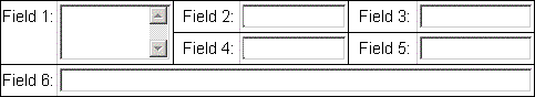
Field1 spans over two rows (spanY="2"), Field6 over three columns (spanX="6", label columns are counted!). The field positions and spans should be set as follows (provided the fields are listed as sub elements of the form in ascending order from Field1 to Field6):
| Field | y | x | spanY | spanX |
|---|---|---|---|---|
Field1 |
0 |
2 |
||
Field2 |
||||
Field3 |
||||
Field4 |
+1 |
|||
Field5 |
||||
Field6 |
+1 |
6 |
Form Property Groups
Form properties can be aggregated to groups allowing a separate layout by placing them inside an element <form-property-group>. Note that fields within a property group are not aligned with fields in other property groups or outside any property group.
The <form-property-group> supports the following attributes:
ariaLabelPrefix – Whether to use the group label as ARIA label prefix for the form properties in the group.
groupRenderer – The reference to a renderer definition to be used for displaying the group of properties. The renderer configuration file “renderers-config.xml” must contain an entry with this identifier. See the section "Renderers Configuration renderers-config.xml" in this chapter for details.
hideIfEmpty – Indicates that the group is visible only if at least one of its properties has a non-empty value.
label – The message key for the text to be displayed as form property group label. The default value is “group.label.<form group name>”.
level – The group’s label level; highest and default level is 0. Only used for the attribute modification approval form.
name – The group name. The name must be unique within the form.
rendererProperties – A semicolon separated list of name/value pairs defining properties transparently passed to the group renderer. The properties can be referenced in HTML or Javascript code snippets. Property name and value must be separated by a colon. This is a convenient way to define custom renderer properties whose values vary with the form group. The property values accept expressions.
script – The name of a script file to be included within the HTTP response.
spanX – The width or horizontal size of the element in number of grid cells. It is used to place the group in a virtual table grid. This attribute defines the number of table cells the element will cover in horizontal direction. The default number is 2.
spanY – The height or vertical size of the element in number of grid cells. It is used to place the group in a virtual table grid. This attribute defines the number of table cells the element will cover in vertical direction. Note that label columns are counted.
visible – A boolean flag indicating whether this group is to be displayed. It is used to show or hide form groups depending on certain conditions. Accepts expressions.
x – The relative position of the element in a row. The group is displayed to the left of all other fields with a higher x-value in the same row.
y – The vertical position of the element in coordinate points. It is used to place the group in a virtual table grid. This attribute defines the index of the table row where the upper left corner of the element is located. If omitted, the system appends this field to the same row as the previous one. A value of “+1” places the group in the next row.
Form Property Lists
A form property list describes a form which displays a special kind of list like for example on a plug-in of the home page. It accepts up to three list properties as sub items.
<form-property-list> supports the following attributes:
fieldRenderer – The reference to a renderer definition to be used for displaying the list. The renderer configuration file “renderers-config.xml” must contain an entry with this identifier. See the section "Renderers Configuration renderers-config.xml" in this chapter for details.
icon – The icon to be displayed alongside each list entry; a file name relative to folder resources/images.
iconTitle – The message key for the icon tooltip.
name – The list name. The name must be unique within the form.
openAction – The Struts action to be invoked when clicking on a list item. The action may be optionally followed by a menu key and item saying that the action is only enabled for users that have the corresponding menu access right. Sample: /openRole.do:RoleMgt.summary.
openDescription – The message key for a description of the open action.
rendererProperties – A semicolon separated list of name/value pairs defining properties transparently passed to the list renderer. The properties can be referenced in HTML or Javascript code snippets. Property name and value must be separated by a colon. This is a convenient way to define custom renderer properties whose values vary with the property list. The property values accept expressions.
size – The number of elements to be displayed in the list. The preferred way is to specify the list size as a parameter of the corresponding Struts action.
sortIndexes – A comma-separated list of column indexes defining the sort order. Default is “0,1,2”.
Form Imports
A form may include another one. The fields and groups of the imported form are inserted immediately after the form field, group or import preceding the import statement. The imported form will start on a new line but is not automatically terminated with a new line. The included form may itself import another one.
The <form-import> element supports the following attributes:
name – The name of the form bean to be included.
The included form must be defined before it is imported.
Form Includes
Form includes are used to include a form into another one. It is used only for the attribute modification approval form.
The <form-include> element supports the following attributes:
name – The name of the form to be included.
objectTypes – A comma-separated list of object types the element applies to.
workflowPaths – A comma-separated list of regular expressions matching the workflow paths the element applies to.
For a detailed description see the chapter on attribute modification approval in the DirX Identity Web Center Customization Guide.
Data Property
The element <data-property> is a sub element of the <form-property> of an object set to be displayed in a table. A <data-property> describes a single table column.
The following attributes are defined:
align – The HTML column alignment, one of left, right, center or justify.
cellRenderer - The renderer to be used for displaying the cell content of this column. This attribute must be a valid entry in the renderer configuration file renderers-config.xml. The attribute accepts expressions.
headerRenderer - The renderer to be used for displaying the content of the header cell for this column. This attribute must be a valid entry in the renderer configuration file renderers-config.xml.
label – The message key for the table column label. The default value is “ldap.attribute.<data property name>”.
mandatory – A Boolean flag for editable data properties indicating whether their values may be empty (false) or not (true). The default value is false. The attribute accepts expressions.
messagePrefix – A prefix for message keys related to this data property.
name - The name of the data property described by this element, most often the LDAP name of an attribute of the objects to be displayed. Required. You can make use of placeholder names such as “$displayName”, which are defined in the object description of the corresponding object.
readonly – A Boolean flag to indicate whether the property may be edited (readonly = false). The default value is true.
readonlyRow – A comma-separated list of cell values that cause the entire table row containg the cell to be read-only.
rendererProperties – A semicolon separated list of name/value pairs defining properties transparently passed to the field renderer. The properties can be referenced in HTML or Javascript code snippets. Property name and value must be separated by a colon. This is a convenient way to define custom renderer properties whose values vary with the form property. Sample: rendererProperties="targetId:accountsForm;tooltip:accounts.tooltip". The property values accept expressions.
sortable – Whether the column is sortable (true) or not (false). Default: true for read-only columns, false for editable columns.
sortIndexes - A list of column numbers representing the order of sorting when this column is selected. This attribute must be written as "columnNumber, columnNumber, …". The indexing of columns starts with 0.
transient – Indicates that the data property is an artificial one not intended to be stored in the directory when saving an entry.
type – The fully-qualified Java class name of the field underlying this property, optionally followed by "[]" to indicate that the field is indexed. Required.
visible – A boolean flag indicating whether to display this column. Accepts expressions.
whitespace – The CSS property value that specifies how to handle white space in the values displayed in this column. Sample values are normal, pre and nowrap.
width – The width of the column in average char width (approx. 10) or pixel (depends on element type). We recommend that you specify the width of an element as a percentage, since fixed values can lead to undesirable results in different screen resolutions.
List Properties
The element <list-property> is a sub-element of <form-property-list>. It describes a column in a property list.
<list-property> supports the following attributes:
cellRenderer – The renderer to be used for displaying the cell content of this column. This attribute must be a valid entry in the renderer configuration file renderers-config.xml.
label – The message key for the list column label. If no label is specified, the column is displayed without header.
messagePrefix – A prefix for message keys related to this data property.
name – The name of the form property described by this element, most often the LDAP name of an attribute of the objects to be displayed.Required.You can make use of placeholder names such as “$displayName”, which are defined in the object description of the corresponding object.
rendererProperties – A semicolon separated list of name/value pairs defining properties transparently passed to the list property renderer.The properties can be referenced in HTML or Javascript code snippets.Property name and value must be separated by a colon.This is a convenient way to define custom renderer properties whose values vary with the list property.The property values accept expressions.
type – The fully-qualified Java class name of the field underlying this property, optionally followed by "[]" to indicate that the field is indexed.Required.
whiteSpace – The CSS property value that specifies how to handle white space in the values displayed in this column.Sample values are normal, pre and nowrap.
width – The width of the column.We recommend that you specify the width as a percentage of the total list width, since fixed values can lead to undesirable results in different screen resolutions.
Converter Definitions converters.properties
During HTTP request processing, Struts attempts to set the properties of the form associated with the request from the HTTP request parameters.Values of request parameters, however, are always of type String.If a form property is of a different type, Struts needs to convert the String value to the respective target type.Struts uses a list of default mapping rules, based on which the conversion is accomplished for most target types.For other types, specific converters can be implemented and plugged in into Struts.
The converter definitions file contains the definition of a special converter to map HTTP request parameter values to a java.util.Map.The converter is registered with Struts on application start-up.
The definition maps the property type java.util.Map to the Java class implementing the conversion.Two additional arguments define how map elements are delimited in the String representation, and how key and value of each element are separated.
Sample:
java.util.Map=com.siemens.webMgr.util.MapConverter;!NI!;!NV!
The implementing Java class is com.siemens.webMgr.util.MapConverter. Map items are separated by “!NI!”, while keys are separated from values by “!NV!”.
For example, the request parameter value
“My birthday!NV!111!NI!My father’s first name!NV!111!”
is converted to the Map
{My birthday=111, My father’s first name=111}
| The file is not really intended to be customized since each listed converter must implement the interface com.siemens.webMgr.util.ParameterizedConverter. |
Renderers Configuration
Any user interface control in any form appearing in a Web Center JSP page must be converted to HTML and/or Javascript code before it can be inserted into the resulting HTML page which is then sent to the client browser.These converters are called renderers and can be configured using the file renderers-config.xml in the WEB-INF/config directory.
A renderer is associated with a Java data type.Renderers are already pre-configured for the most typical data types in
WEB-INF/config/defaultRenderer.properties.
These definitions apply, when a form property does not explicitly reference a renderer, as well as for dynamically generated request workflow forms without a form bean configuration.
Adding a new renderer (which should not be necessary in most cases) mainly requires an appropriate code snippet, which is either simply a piece of HTML code or JavaScript code.In some special cases (where the BasicRenderer class cannot be used), some Java programming is also necessary (as is done for the search panel or the table).
Renderers Configuration renderers-config.xml
The renderer configuration defines all modules producing the final HTML code for a particular page element. They are referenced from various form bean configuration elements.
The root element <renderers> contains a <renderer> child element per renderer.
Element <renderer>
The <renderer> element describes a single renderer for a particular data type. Its child elements <renderer-property> define renderer specific properties as name-value pairs.
The following attributes are defined for the <renderer> element:
id - The identifier of the renderer. This value is the reference name used in the forms configuration. Required.
extends - The id of a renderer this renderer is derived from. A renderer inherits all its attributes and properties from its superior renderer but may override one or more of them.
type - The fully-qualified Java class name of the attribute to be rendered.
className - The fully-qualified name of the renderer class. Required.
defURL - The name of the code file for the default renderer. By convention, the code accessed here constructs a renderer for read-only operations. Required.
altURL - The name of the code file for the alternate renderer. By convention, the code accessed here constructs a renderer for read-write operations.
jsURL - The name of the JavaScript code file for the table cell renderer. By convention, this code is used to render the field in a table cell. It should contain just a single line with the short name and the arguments of the Javascript function rendering the cell.
roJsURL - The name of the JavaScript code file for the table cell renderer in case the cell is read-only. By convention, this code is used to render the field in a table cell. It should contain just a single line with the short name and arguments of the Javascript function rendering the cell.
Note that code file names must be specified relative to the application’s document root folder, and must start with a slash.
Element <renderer-property>
The element <renderer-property> describes renderer-specific attributes as name-value pairs. These additional attributes can be used during rendering for various purposes. Usually, such a value definition is made together with the definition of a respective placeholder ${<attribute name>} in the code snippet. During rendering the placeholder is replaced with the value defined here.
The defined attributes are:
name - The name of the property.
value - The value of the property. Note that these values will be localized. It is thus possible to use resource keys here. It is also legal to use Java-Standard-Tag-Library expressions as property values.
Sample Renderers
Important renderers are:
-
text - Creates a text entry field in edit mode to be used to enter text content, for example. a description or a name.
-
combobox - Creates a combo box to select values from a tag list. Note that the tag list must be in the DirX Identity object description of the attribute.
-
objectSearch - Creates a text entry field and an action button. When the button is clicked, an action with the attribute name is called. This renderer can be used to implement a search panel to select a DN of an assigned object. The referenced object’s “cn” is displayed in the text field.
-
userSearch - Displays the attributes “sn” and “givenname” of the selected user. This renderer is very much like the objectSearch, but specialized for users.
The type String[] is often used for multi-value attributes. Some important renderers for that type are:
-
stringList - Creates a list entry box. Each value is entered as a free string.
-
optionList - Creates a list entry box. Each value is entered via a combo box. Note that the list of values has to be defined in the appropriate object description.
-
userLinks - Creates a list entry box. Each value is entered via a userSearch widget.
Default Renderers defaultRenderer.properties
The file “defaultRenderer.properties” associates default renderers for commonly used object form property types, names, and editors.
The first file section, Data types, maps form property types to renderer identifiers. Form property types are class names assigned to attribute type of <form-property> elements in forms configuration files.
The second file section, Editors, maps editor class names to renderer identifiers. Editors are assigned to object properties in object descriptions.
The third file section, Properties, maps form property names to renderer identifiers. Form property names are class names assigned to attribute name of <form-property> elements in forms configuration files. If a property name is followed by an object type specification (<property name>@<object-type>, e.g. manager@ctxlocation), the assigned default renderer applies only to that object type. This way, you can assign different default renderers to the same property of different object types.
At runtime, the actual renderer for a form property is determined in the following order:
Form property attribute fieldRenderer
Form property name (section Properties)
Form property type (section Data types)
Forms used when performing a request workflow activity are not configured in forms configuration files but in request workflow definitions in the DirX Identity provisioning store. Types and field renderers for properties of these forms are looked up from property attributes type and editor in the corresponding object descriptions.
Note that the default renderer mappings are case sensitive. Class names, form property types and names, and renderer identifiers must exactly match their counterparts.
Renderer Code Snippets
Any renderer implementation uses code snippets to render user interface elements. These snippets are located in the WEB-INF/snippets directory.
A code snippet is either a piece of HTML code (for example, the simple text field) or a JavaScript (for example, all table cell renderers) or both (for example, a calendar or table). A code snippet uses placeholders that the renderer class replaces with runtime values, thus finalizing the code before it is streamed to the client. The big advantage of these renderers is that the developer of the customized application can modify them to meet the customer’s requirements.
Placeholder Value Escaping
Values substituted for placeholders may contain special characters that must be properly escaped in order not to break the generated HTML page or Javascript code. Incorrect escaping also makes a page prone to script code injection attacks by hackers when form input values or request parameters are inserted as part of the response page. The escape algorithm to apply depends on the specific location of the placeholder in the snippet.
Web Center provides a couple of escape methods. By appending a suffix to a placeholder you define which escape method to apply to the substituted value.
The supported suffixes are
-
.h – Apply HTML escaping.
-
.jsArr – Trim the value and check if it starts with a left and ends with a right square bracket. If not, replace the placeholder with an empty Javascript array “[]” (without quotes).
-
.jsObj – Trim the value and check if it is enclosed in curly braces. If so, replace the placeholder with the value, otherwise with an empty Javascript object “{}” (without quotes).
-
.jsBool – Trim the value and check if it is empty, equals “0” or “false”. If so insert “false”, otherwise “true” (without quotes).
-
.jsInt – Trim the value and check if it is a sequence of digits, optionally preceeded by a “+” or “-“. If so, replace the placeholder with the number, otherwise with “0” (without quotes).
-
.jss – Apply Javascript escaping to substitutions for placeholders in Javascript strings enclosed in single quotes.
-
.jsd – Apply Javascript escaping to substitutions for placeholders in Javascript strings enclosed in double quotes.
-
.jssd – Apply Javascript escaping to substitutions for placeholders in Javascript strings enclosed in inner single quotes and outer double quotes.
-
.id – Generate a valid HTML id. An HTLM id may contain only ASCII letters, digits and underscores ([a-zA-Z_0-9]). The escaper first replaces each invalid character with an underscore, and then strips leading underscores.
-
.ids – Generate a comma-separated list of valid HTML ids
-
.subId – Like “.id” but without stripping leading underscores.
-
.subIds – Like “.ids” but without stripping leading underscores.
If a placeholder represents a URL, the substituted value must be properly URL encoded before applying any other escape method:
-
.url.h – First URL encode the value, and then apply .h escaping.
-
.url.jss – First URL encode the value, and then apply .jss escaping.
-
.url.jsd – First URL encode the value, and then apply .jsd escaping.
-
.url.jssd – First URL encode the value, and then apply .jssd escaping.
Javascript snippets for table cells apply the .jss escaping by default but support also the methods .jsArr, .jsObj, jsBool, .jsInt, .id, .ids, .subId and .subIds.
Including Script Files
HTML snippets may include Javascript or VBScript files. The way how to include the scripts depends on the type of the HTTP request. Requests that return a complete HTML page use the HTML <script> tag, for example:
<script
    src="${webCenter.resourceFolder}/scripts/wwPropertyList.js">
</script>
<script>WWPropList.initialize(…)</script>
The object WWPropList is defined in script file wwPropertyList.js. Since the browser executes the second script only after having loaded the file, this works fine.
However, the sample does not work for asynchronous requests that update only parts of an HTML page. The browser defers loading the script file, so that executing the second script fails since WWPropList is not yet defined. The sample works only if the file is already in the browser cache.
Web Center provides a Javascript function for including script files in asynchronous request:
addScript (src,type,sync,cond)
The first argument is the script file URL.
The second argument is the script type like “text/javascript” or “text/VBscript”; it defaults to “text/javascript”.
The third argument is the name of an object, variable or function defined in the script file. It is used to check whether the file must be loaded, and if so, to check when loading is finished. Execution of other scripts will be deferred until all script files are available.
The optional fourth argument, a boolean, indicates that the script file is required only under a certain condition. The value IS_MSIE, for example, causes the script to be included only if the browser is Internet Explorer.
The code of the above sample for asynchronous requests is
<script>addScript(
    "${webCenter.resourceFolder}/scripts/wwPropertyList.js",
    "","WWPropList")</script>
<script>WWPropList.initialize(…)</script>
Since an HTML snippet may be used in both types of HTTP requests Web Center provides a separate tag for including script files in renderer snippets. The tag is dynamically replaced with the proper code for each request.
<includeScript src="…" type="…" sync="…" cond="…"/>
The tag attributes src, type, sync and cond correspond to the arguments of function addScript. Attribute src accepts expressions, while the other ones do not.
Each includeScript tag must be on a single line and surrounded by white spaces only.
The sample code now looks like this:
<includeScript
    src="${webCenter.resourceFolder}/scripts/wwPropertyList.js"
    sync="WWPropList"/>
<script>WWPropList.initialize(…)</script>
HTML Snippet Samples
<input type="text" id="${id.id}" name="${name.h}"
       class="roTextField" style="${style.h}" value="${value.h}"/>

alertError("${value.jsd}","${confirmTo.jsd}","${confirmButtons.jsd}");

<input type="submit" name="${name.h}" value="${value.h}"
       onclick="return submitter.submit(
         '${checkRequired.jssd}'==='false','${confirmMessage.jssd}')"/>

<table id="${name.id}" width="100%" cellpadding="0" cellspacing="0"
       class="tableBorder">

<iframe frameborder="false" width="${width.h}" height="${height.h}"
        class="${className.h}" src="${srcURL.url.h}"></iframe>

Tree.open(${data},"${params.jsd}",
    opener.document.getElementById("${targetField.jsd}"),false,false,
                                   "${loadChildrenAction.url.jsd}");

<button onclick="return postRequest('${saveURL.url.jssd}')"
                 class="labeledButton">${buttonLabel.h}</button>
Object Configuration objects-config.xml
The object configuration mainly translates object and attribute definitions from the DirX Identity service layer to the Web Center application and back.The reason for this is somewhat technical: while many of the DirX Identity virtual object attributes contain a "." in their names, this cannot be used by the Web Center application, since it works together with the Commons bean utilities which would try to resolve "."-notations as object references.To circumvent this, we transform attribute names in the following manner:
The first term of an attribute name left to the "." character is the object set, the term on the right the relation.The objects appearing are defined as <object> elements, the relations as <relation> elements.In the Web Center application we use the name of a <relation> definition as attribute name prefix and append the name of an <object> definition with a capitalized first character.This leads to a mapping
<relation name><object name> => object.relation
Example:
Object definition: <object id="role" …/>
Relation definition: <relation name="available" value=".toAssign"/>
Web Center attribute: availableRoles (with the "r" of "roles" capitalized)
DirX Identity service layer attribute: roles.toAssign
The root element of an object configuration is <object-configuration>. It contains 2 child elements:
<objects> - Contains a list of <object> elements for each object.
<relations> - Contains a list of <relation> elements for each object relation.
Element <object>
The element <object> describes a single DirX Identity service layer object.
The following attributes are defined:
id – The identifier for the object. This value is the name used in attribute names. Required.
nodeClass – The fully-qualified Java class name of the service layer object. Required.
dirClass – The type, i.e. the object description name, for this object. The list of valid object types can be viewed in the DirX Identity Manager when editing access policies.
masterClass – The fully-qualified Java class name of the object’s master node, which owns the object. This attribute is used especially for assignments (where the user entry class having the assignment is the master class). The attribute accepts several master classes, separated by commas.
def – Object elements may share the same combination of nodeClass and masterClass. In each a case, exactly one of the elements must be defined as default element by setting its def attribute to “true”.
set – The set name for this object. The default set name is obtained by appending an “s” to the object identifier. There are a couple of predefined set names, like “groups”, “roles” and “activities”, and a general purpose set name “GenericNodes”.
Element <relation>
The element <relation> describes the attribute mapping for a particular object relation.It requires the following attributes:
name – The name of the relation.
value – The value of the relation.Note that it must start with a ‘.’.
Search Filter Configuration
The Web Center search panel supports searching for attributes with DN syntax, like user manager or a role owner.For example, you may search for all groups whose owner has a surname starting with “ab”.Web Center first searches for possible owners, that is users whose surname starts with “ab”.Then it searches for all groups whose owner matches one of the candidates found.Be aware that the final search result may be somewhat surprising since the first search may hit a size or time limit.
You can define some individual and some general options for the first search.
Element < filter-configuration>
The root element of the XML document with a single child element <options> and a single child element <filters>.
Element <options>
The element defines global settings that apply to all DN attribute searches.
sizeLimit – The size limit for the search operations. Default: The size limit configured for the domain object.
timeLimit – The time limit for the search operations. Default: The time limit configured for the domain object.
accessPoliciesEnabled – Whether to apply access policies to the search results. Default: true.
isPresentSearchEnabled – Whether the searches support match rule isPresent. Deafult: false.
Element <filter>
The element maps the name of a search panel attribute and optionally the object set name to search parameters. The search parameters are specified in one or more child elements <search>. Each child element describes a search operation. The total search result is the sum all search results.
additionalFilter – A filter component that must be matched in addition to the filter components resulting from the search elements.
attributes – The comma-separated list of attribute names the filter applies to. Required.
objectSets – The comma-separated list of object sets the filter applies to.If left unspecified, the filter applies to all object sets without specific filter assignment.
Element <search>
The element defines the base object and a search filter.The search filter is applied in addition to the one entered by the user in the search panel.
base – The search base, without domain root.The domain root will be appended.Default: domain root.
filter – The search filter.Default: (objectclass=*).
Validators
You can configure validators using standard Struts configuration for validation of user input.For details see the Struts overview documentation.
You must configure the Validator Plug-In in the Struts configuration file WEB-INF/config/identity/struts-config.xml.The validator by default expects the validation rules in file validator-rules.xml, but you can pass a list of file names to its property “pathnames”.Here is an example:
<plug-in className="org.apache.struts.validator.ValidatorPlugIn">
    <set-property property="pathnames"
                  value="/WEB-INF/config/validator-rules.xml,
                         /WEB-INF/config/validation.xml"/>
</plug-in>
This definition instructs the Validator Plug-In to read its validation rules from the files “validator-rules.xml” and “validation.xml”. This approach allows you to separate validator definitions from validation forms to which the validations are applied. As a result, you can re-use your validators in another application and define the validations that are specific to each application.
According to the Struts documentation, your forms must extend the class org.apache.struts.validator.action.ValidatorForm instead of org.apache.struts.action.ActionForm.
Then, when the validate method is called, the action’s name attribute from the Struts Configuration is used to load the validations for the current form. The form element’s name attribute in the Validator configuration should match the action element’s name attribute.
The Struts Validator comes bundled with several ready-to-use validators. They include: required, mask, byte, short, int, long, float, double, date (without locale support), and a numeric range.
Web Center is prepared for validations. Most of its forms are implemented by the class com.siemens.webMgr.model.DynaLocaleForm, which extends the Struts class DynaValidatorActionForm and in turn the ValidatorForm.The Struts configuration file “struts-config-xml” in folder “config/identity” defines the Validator plug-in among a number of other plug-ins. In order to activate validations for one of the forms, you must insert the proper definitions in the file “validations.xml”.
Note that Web Center support for validations is incomplete in that way that the Struts handling of form validation errors does not really fit together with the error handling in Web Center.
The Struts Validator Plug-In is by default disabled for security reasons. You can enable it via property struts.validator.enabled in file webCenter.properties.