Renderers
Overview
Any user interface control in any form appearing in a Web Center JSP page must be converted to a standard HTML tag before it can be inserted into the resulting HTML page which is then sent to the client browser.These converters are called renderers.
The standard renderers are defined in file WEB-INF/config/renderers-config.xml.Each renderer has the following attributes:
-
id – The renderers unique id; required.
-
type – The Java class of the properties the renderer is used to display or edit, like “java.lang.String”, “java.lang.String[]” or “java.util.Map”.Default: “java.lang.String”.
-
className – The renderer class.For each supported type, Web Center provides a special renderer class which handles the conversion of properties of that type to HTML and Javascript.Default: “com.siemens.webMgr.taglib.view.renderers.BasicRenderer”.
The conversion is based on HTML and Javascript code snippets which are assigned as attributes to each renderer.There are four different types of snippets:
-
defURL – The default HTML code snippet for displaying the property in an HTML form. This attribute is required.
-
altURL – The HTML code snippet for displaying the property in edit mode in an HTML form.Default: defURL.
-
jsURL – The default Javascript code snippet for displaying the property in an HTML table cell.
-
roJsURL – The Javascript code snippet for displaying the property in read-only mode in an HTML table cell.Default: jsURL.
Renderer properties can be used to pass variable values to a renderer class and renderer snippets.While each renderer class has a predefined set of supported properties, renderer snippets may use additional properties which are referenced in the snippets by their name.If a renderer property value is a message key, it is replaced by the actual localized message text at runtime.
A renderer can also inherit code snippets and properties from another renderer, and reassign just the ones that are different:
-
extends – The id of the parent renderer.The renderer inherits type, class, snippets and properties.
Custom File Overview
In this section, we assume that custom files are located below the application’s root folder in the following way:
resources
	custom
		messages
			de
				messages.js
			en
				messages.js
		scripts
			custom.js
		styles
			small
				styles.css
			medium
				styles.css
			large
				styles.css
WEB-INF
	classes
		resources
			languages
				de
					text_de.properties
				en
					text_en.properties
	config
		webCenterCustom.properties
	custom
		config
			converters.properties							defaultRenderers.properties
			messages.properties
			objects-config.xml
			renderers-config.xml
		jsp
			scriptsAndStyles.jsp
You may choose different folders and names for your custom files.Files with fixed names and locations are printed in bold font.See the “Customization Files” for details.
Customizing Renderers
You can write a new renderer from scratch, providing your own code snippets and all.On the other hand, you can derive a new renderer from another one by assigning different values to its renderer properties, or by reassigning one or more of its code snippets.
Samples for each alternative are given below.As always, you should try to get away with the simplest solution, reusing as much as possible.
When adding new components like renderer definitions, code snippets, message texts and stylesheet classes, it’s good to make the new components easily distinguishable from the standard components, either by assigning names that start with a specific prefix (like “custom”), by using dedicated naming scopes, or by putting them in separate folders.This makes it easier to migrate the extensions to later product versions.
We also strongly recommend to keep customizations in separate files and to keep changes to the files delivered with Web Center at a minimum.
The next sections describe in detail how to write customized renderers.To get a first feeling of how it works, take a look at the simple samples in the last section.
Creating a New Renderer
Creating a new renderer from scratch involves the following steps:
-
Writing HTML and/or Javascript code snippets.
-
Defining the renderer in a custom renderers definition file.
In addition to that, it may further involve
-
Adding messages to text_<language>.properties files.
-
Adding style definitions to stylesheets.
-
Adding images.
-
Adding code to Javascript source files.
We will walk through the steps by means of a sample.
Sample Renderer Use Case
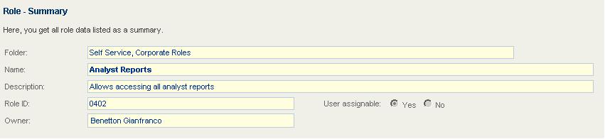
Let’s say we want to write a new renderer for boolean properties that displays two radio buttons for the property value, one for “true” and one for “false”. The radio button for “true” should be checked if the property value is “true”, while the radio button for “false” should be checked otherwise. The button labels, i.e. the text to be displayed along with each button, should be localizable and have the same color and font as other labels. The renderer is to be used in HTML forms in read-only as well as in editable mode.
The following figure shows how this renderer displays the user assignable flag of a role:
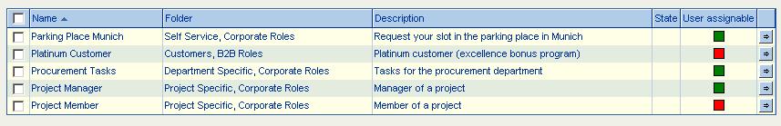
In table columns for boolean properties, green squares should indicate “true”, while red squares indicate “false”. One can change color and value by clicking on a square.
The following figure shows how this renderer displays the user assignable flag of roles:
Renderer Definition
We define the new renderer in file
WEB-INF/custom/config/renderers-config.xml:
<renderer id="customBoolean" type="java.lang.Boolean"
	   defURL="/WEB-INF/snippets/custom/boolean/roBoolean.htm"
	   altURL="/WEB-INF/snippets/custom/boolean/rwBoolean.htm"
	   jsURL="/WEB-INF/snippets/custom/boolean/boolean.js">
    <renderer-property name="labelTrue"  value="custom.boolean.yes"/>
    <renderer-property name="labelFalse" value="custom.boolean.no"/>
</renderer>
The renderer id starts with “custom” in order to make it clear that it is a customized renderer.
The type “java.lang.Boolean” is determined by the types of the properties the renderer is used to display. We don’t have to assign a renderer class name since the default class will do.
The code snippet assigned to “defURL” will be used to display boolean properties in read-only mode in HTML forms, while the snippet assigned to “altURL” is for displaying the properties in editable mode.
The code snippet assigned to “jsURL” will be used to display boolean properties in table cells. The renderer applies to read-only and read-write properties.
The custom renderer properties “labelTrue” and “labelFalse” accept the message keys for the button labels. The properties will be used in the code snippets.
Code Snippets
HTML Form Field - Read-Only Mode
The HTML code snippet for read-only mode is defined in file roBoolean.htm:
<input type="radio" name="${name}" id="${id}_true" value="true"
       disabled="disabled"/>
<span class="customBooleanLabel">${labelTrue}</span>
<input type="radio" name="${name}" id="${id}_false" value="false"
       disabled="disabled"/>
<span class="customBooleanLabel">${labelFalse}</span>
<script>custom.initRadioButton("${id}","${value.jsd}");</script>
The snippet adds two radio buttons with the same name, the property name. The first button is used for property value “true”, the second one for “false”. The buttons are disabled since the snippet is for read-only pages only.
Each radio button is followed by its label. The labels reference the custom renderer properties “labelTrue” and “labelFalse”, respectively. The labels are enclosed in “span” elements that define their CSS class name.
The Javascript scriptlet at the bottom of the snippet checks if the actual property value is “true” or “false”, and activates the corresponding radio button.
The snippet references (via ${…} expressions) some renderer properties that are replaced at runtime by their actual values:
-
name – The property name.
-
id – A unique HTML element identifier which is essentially the concatenation of the form name and the property name, separated by an underscore. The id can be used in Javascript code to find HTML elements defined in the code snippet.
-
value – The property value. The extension “.jsd” indicates to Web Center that the value is used within Javascript code and is enclosed in double quotes. Web Center uses this information to properly escape the value.
-
labelTrue and labelFalse – The custom renderer properties for the label message keys. At runtime, the variables are replaced by the corresponding localized message texts.
The HTML code generated at runtime may for example look like
<input type="radio" name="dxrUserAssignmentPossible"
    id="overviewRoleForm_dxrUserAssignmentPossible_true"
    value="true" disabled="disabled"/>
<span class="customBooleanLabel">Yes</span>
<input type="radio" name="dxrUserAssignmentPossible"
    id="overviewRoleForm_dxrUserAssignmentPossible_false"
    value="false" disabled="disabled"/>
<span class="customBooleanLabel">No</span>
<script>custom.initRadioButton("${id}","${value.jsd}");</script>
HTML Form Field - Editable Mode
The HTML code snippet for read-write mode is defined in file rwBoolean.htm:
<input type="radio" name="${name}" id="${id}_true" value="true"/>
<span class="customBooleanLabel">${labelTrue}</span>
<input type="radio" name="${name}" id="${id}_false" value="false"/>
<span class="customBooleanLabel">${labelFalse}</span>
<script>custom.initRadioButton("${id}","${value.jsd}");</script>
The snippet is almost identical to the read-only snippet. The only difference is that the radio buttons are not disabled in order to allow for changing their values.
Javascript Functions
The above renderers invoke Javascript functions to check a radio button and to render values in table cells.
We choose a separate naming scope for our extensions, namely “custom”, in order to avoid naming conflicts with existing Javascript code.
Scriptlet Function
The code to check a radio button is:
var custom = {
    initRadioButton: function(id,value) {
        var button = value === "true";
        document.getElementById(id+"_"+button).checked = true;
    },
    ...
};
Table Cell Renderer Function
The task of a table cell renderer function is to create the DOM representation for the property value. This may be just a single DOM element, or a DOM tree. The renderer does not add the DOM representation to the table cell but just returns the DOM element or the root of the DOM tree to the caller.
Renderer functions are invoked with a couple of predefined arguments:
-
p – The DOM element representing the table cell.
-
n – The request parameter name used to send modified property values to the server.
-
m – Indicates whether to generate cell content for read-only (m === READONLY) or read-write mode (m === READWRITE). READONLY and READWRITE are Javascript constants in global scope.
-
v – The current property value (after editing it), or null.
-
phValue – The original property value, as sent from the server.
In addition to that, some complex renderers have additional arguments.
The sample code to render boolean values in read-only mode is
var custom = {
    ...
    renderBoolean: function(p,n,m,v,phValue) {
        var isTrue = (v || phValue) === "true";
        var square = document.createElement("div");
        square.className = isTrue ? "customYesCell" : "customNoCell";
        return square;
    }
}
The sample renderer creates a new “div” element and assigns it a CSS class depending on the value of the boolean property.
In order to extend the above function to read-write mode, we first have to understand how tables work in Web Center. If a table is newly displayed, Web Center invokes the renderer functions for each table cell in read-only mode with arguments
(m,v,phValue) === (READONLY,null,<initial value>).
If one clicks on a table cell, Web Center invokes the renderer function of the cell in read-write mode with arguments
(m,v,phValue) === (READWRITE,null,<initial value>).s
On value changes, the renderer must store the new value in attribute “value” of a DOM element (created by the renderer) with id “<cell id>_edit”. Then, if one clicks somewhere outside the table cell, Web Center persists the possibly modified value in a hidden field and invokes the renderer function again in read-only mode, but this time with arguments
(m,v,phValue) === (READONLY,<modified value>,<initial value>).
If the cell is clicked again, the renderer function is called in read-write mode:
(m,v,phValue) === (READWRITE,<modified value>,<initial value>).
Before Web Center invokes a renderer function it deletes the content of the table cell. The renderer, therefore, has to recreate the table content on each invocation.
In our sample, we want let the users change a boolean value by clicking on a square, but not by clicking into the cell somewhere outside the square. This poses a slight difficulty since the “div” elements representing the squares do not propagate clicks to the table cell. Thus, a click on a square will not lead to a call of the cell’s renderer function. On the other hand, a click somewhere outside the square will invoke the renderer function but should have no effect at all.
Therefore, we first assign an onclick handler to the square:
square.onclick = custom.squareClicked;
The onclick handler gets the DOM element representing the table cell, sets its “squareClicked” attribute to “true”, and propagates the click to the table cell by firing a corresponding event, which will lead to a call of the cell’s renderer function in read-write mode:
    var p = getSource(e).parentNode;
    p.squareClicked = true;
    fireEvent("click",p);
| The handler uses the utility functions “getSource” and “fireEvent” defined in one of Web Center’s Javascript files. |
Now, whenever our renderer function is called in read-write mode, we have to check the value of the cell’s “squareClicked” attribute. If its value is “true”, the call was caused by clicking on the cell’s square, and we must invert the value of the boolean property and reset the attribute. Otherwise, we don’t change the value:
    if (p.squareClicked) {
        isTrue = !isTrue;
        p.squareClicked = false;
    }
Finally, we save the current boolean value in the square’s “div” element, and set its id to the cell’s id plus “_edit”:
    square.id = p.id + "_edit";
    square.value = isTrue ? "true" : "false";
This will let Web Center store the new value in a hidden field when the cell changes back to read-only mode. Note that the lifetime of the “div” element is temporary since the cell content is cleared each time the renderer is invoked.
The complete renderer code is:
var custom = {
    ...
    squareClicked: function(e) {
        var p = getSource(e).parentNode;
        p.squareClicked = true;
        fireEvent("click",p);
        return false;
    },

    renderBoolean: function(p,n,m,v,phValue) {
        var isTrue = (v || phValue) === "true";
        var square = document.createElement("div");

        if (m === READWRITE) {
            if (p.squareClicked) {
                isTrue = !isTrue;
                p.squareClicked = false;
            }
            square.id = p.id + "_edit";
            square.value = isTrue ? "true" : "false";
        }

        square.className = isTrue ? "customYesCell" : "customNoCell";
        square.onclick = custom.squareClicked;
        return square;
    }
}
Registering Renderers
Web Center provides a Javascript object named renderers which is responsible to decide which renderer to take for which table cell. The object keeps a map of renderer ids to renderer functions. Initially, the map is filled with the standard cell renderers provided with Web Center.
Custom cell renderers must be registered with the renderers object in order to get added to the map. The object provides a registration method:
-
register(renderer …) – Registers one or more cell renderers. The function accepts one or more arguments. Each argument is an array of three items:
-
id – The renderer id..
-
type – The renderer type, one of args, noArgs and noValue. Use args for renderers with additional arguments besides the cell value, noArgs for renderers whose only argument is the cell value, and noValue for renderers without any argument at all.
-
f – The renderer function (function).
-
The only argument of our sample custom renderer is the cell value. Thus, we register the renderer with:
renderers.register(["C_BO","noArgs",custom.renderBoolean]);
Message Texts
The renderer uses two message keys for the button labels. We have to assign message texts to the keys for each supported language, like for example English and German.
Stylesheets
The renderer assigns CSS class names to the button labels and to the div elements for the red and green squares. We have to define the classes for each supported stylesheet variant, like for example medium and large.
Medium Font Size
File: resources/custom/styles/medium/styles.css
Definitions:
.customBooleanLabel, .customBooleanRwLabel {
	font:11px Arial,sans-serif;
	padding-left:2px;
	padding-right:2px;
}
.customBooleanLabel {
       color:#666666;
}
.customBooleanRwLabel {
	color:#003366;
}

.customYesCell, .customNoCell {
	border:1px solid black;
	width:11px;
	height:11px;
	font-size:1px;
	position:relative;
}
#msie .customYesCell, #msie .customNoCell {
       display:inline
}
.customYesCell {
	background-color:green;
}
.customNoCell {
	background-color:red;
}
Large Font Size
File: resources/custom/styles/large/styles.css
Definitions:
The styles are identical to the medium ones, except for a larger font size, height and width.
.customBooleanLabel, .customBooleanRwLabel {
	font:12px Arial,sans-serif;
       ...
}

.customYesCell, .customNoCell {
       ...
	width:12px;
	height:12px;
       ...
}
Making the Styles Available to the Client
Import the core tag library and add an include statement for your custom script file to the custom JSP WEB-INF/custom/jsp/scriptsAndStyles.jsp:
<%@ taglib uri="http://java.sun.com/jstl/core" prefix="c" %>
<link rel="StyleSheet" type="text/css"
      href="resources/custom/styles/
          <c:out value="${sessionScope['com.siemens.webMgr.style']}"/>
          /styles.css">
Extending Existing Renderers
Reassigning Property Values
The simplest way to create a new renderer is to extend another one, assign a new id and modify some of its property values.
For example, the renderer “objectSearch displays a text field and an action button.It is used to select the DN of an object that should be assigned to a property of another object, e.g. to the approval workflow link of a role.The assigned object’s “cn” is then displayed in the text field.The name of the display property is defined by the value of the renderer property “pattern”:
<renderer id="objectSearch”
    className="..."
    defURL="/WEB-INF/snippets/textField/roTextField.htm"
    altURL="/WEB-INF/snippets/textField/roUserSearch.htm"
    jsURL="/WEB-INF/snippets/textField/userSearch.js">
  <renderer-property name="action"
                     value="/selectObject.do"/>
  <renderer-property name="changeTooltip"
                     value="application.tooltip.changeValue"/>
  <renderer-property name="deleteTooltip"
                     value="application.tooltip.deleteValue"/>
  <renderer-property name="pattern"
                     value="${cn}"/>
  <renderer-property name="selectObjectTooltip"
                     value="application.tooltip.selectObject"/>
</renderer>
But it’s not always appropriate to display the common name of the assigned object. Organizational units, for example, don’t even have a common name. For links to organizational units, therefore, we define a new renderer derived from “objectSearch”, call it “ouSearch”, and set its “pattern” property to “ou”:
<renderer id="ouSearch" extends="objectSearch">
  <renderer-property name="pattern" value="${ou}"/>
</renderer>
Reassigning Code Snippets
You can derive a new renderer from another one but assign one or more different code snippets to the new renderer.
The following renderer extends our sample renderer “customBoolean” for boolean properties:
<renderer id="customTrueFalse" extends="customBoolean"
	   jsURL="/WEB-INF/snippets/checkbox/checkbox.js">
    <renderer-property name="labelTrue"  value="custom.boolean.true"/>
    <renderer-property name="labelFalse" value="custom.boolean.false"/>
</renderer>
In HTML forms, the renderer displays boolean properties in the same way as its parent renderer, but assigns different message keys to the radio button labels.In HTML table columns, however, the renderer uses a standard code snippet that displays the properties in check boxes.
Assigning Renderers to Properties
Assigning a Renderer to Specific Form Fields
In form beans, you can assign the renderer to form fields or table columns, thereby overriding the default renderers for the properties displayed in the fields or columns.
Form Property
The renderer used to display or modify a property in an HTML form may be assigned as field renderer to a form property:
<form-property name="dxrUserAssignmentPossible"
    type="java.lang.Boolean" fieldRenderer="customBoolean"
    readonly="false"/>
The above definition assigns renderer “customBoolean” to the HTML form field for property “dxrUserAssignmentPossible”.
Data Property
The renderer used to display or modify a property in an HTML table column may be assigned as cell renderer to a data property:
<data-property name="dxrUserAssignmentPossible"
    type="java.lang.Boolean" cellRenderer="customBoolean"
    width="5%" sortIndexes="4,0"/>
The above definition assigns renderer “customBoolean” to the HTML table column for property “dxrUserAssignmentPossible”.
Assigning a Renderer as Default Renderer
Default renderers apply to form or data properties which no specific renderer is assigned to. They apply especially to the properties in the generically generated forms used to perform request workflow tasks since these forms are not associated with any form bean.
You can associate a default renderer to a specific property, or to all properties of a specific type. For generically generated forms, you can also associate renderers with editors that are assigned to properties in object descriptions.
Assignment priority is property name first, editor second, and property type last.
Add custom assignments to file
WEB-INF/custom/config/defaultRenderer.properties.
Property Name
The following line assigns the default renderer “customBoolean” to property “dxrUserAssignmentPossible”:
dxruserassignmentpossible = customBoolean
For generic forms, the default renderer may vary with the object type:
dxruserassignmentpossible = customBoolean
dxruserassignmentpossible@dxrrole = checkbox
The default renderer for the property is “checkbox” for roles, and “customBoolean” otherwise.
Property names and object types must be specified in lower case.
Renderer Samples
By means of two simple samples, this chapter briefly summarizes the steps necessary to write customized renderers.
The renderer customItalicText displays text in table cells as usual but in italics.
The renderer customRedText displays text in (read-only and editable) form fields and in table cells as usual but in red color.
Renderer Definitions
The definitions specify the code snippets to be used for the customized renderers.
WEB-INF/custom/config/renderers-config.xml
<!-- ========== Renderers with custom snippets ========== -->

<renderer id="customItalicText" extends="text"
      jsURL="/WEB-INF/custom/snippets/textField/italicTextField.js"/>

<renderer id="customRedText"
      defURL="/WEB-INF/custom/snippets/textField/roRedTextField.htm"
      altURL="/WEB-INF/custom/snippets/textField/rwRedTextField.htm"
      jsURL="/WEB-INF/custom/snippets/textField/redTextField.js"/>
Renderer Snippets
The snippets contain the Javascript and HTML code used for the customized renderers. The HTML snippets are copied from the snippets for the default renderer text; the only difference is the value of the style attribute.
Javascript Code
The code for the Javascript functions to render values in table cells. The registration maps the renderer ids used in the above Javascript snippets to the corresponding renderer functions.
resources/custom/scripts/custom.js
var custom = {
	/* ==================== Custom renderers ==================== */

	italicText: function(p,n,m,v,phValue) {
		p.style.fontStyle = "italic";
		p.style.fontStretch = "expanded";
		return getTextNode(v||phValue);
	},

	redText: function(p,n,m,v,phValue) {
		p.style.color = "#F00"; // red
		return getTextNode(v||phValue);
	},
	...
};

renderers.register(
	[ "CUSTOM_IT", "noArgs", custom.italicText ],
	[ "CUSTOM_RT", "noArgs", custom.redText ]
);