Form and List Frames
Overview
Web Center display frames around some forms and lists. A form frame must have a title and may have a subtitle and a toolbar. A list frame may have a toolbar and a page size selector.
The tools in a toolbar serve as shortcuts to methods in the main menu for forms and in the context menu for lists. Each tool is visualized by an icon with a tooltip and an optional label.
The Web Center standard application shows frames around most summary and modify forms. You can have frames around other forms as well, but note that some pages display more than one form.
For example, the top row with attributes identifying a user (usually name, organizational unit and phone) forms a separate form on many user pages. If you assign a frame to the main form, the top row will be displayed outside of the frame.
A Sample Form Frame
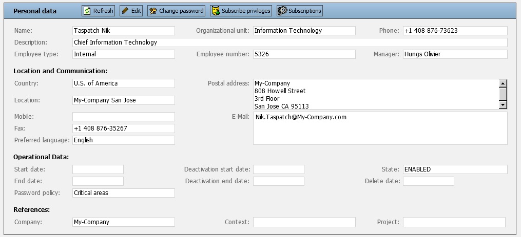
The frame title is “Personal data”.The tools have icons and a tooltip text.
A Sample List Frame
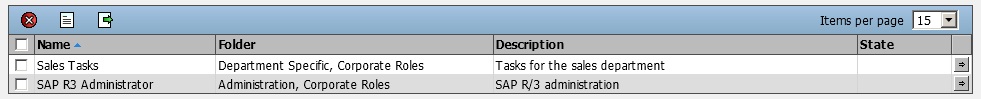
The frame displays a toolbar with icons only and a page size selector.
Titles
A form frame must have a title and may have a subtitle. For example, the title for the user overview form is “User data” while the user modification form has title “User data” and subtitle “Edit mode”. Title and subtitle are separated by a hyphen.
Defining Titles
Titles and subtitles are message texts defined per supported language in message file text.properties. Custom extensions should be done in custom message file text_<language>.properties.
The message key prefix for titles is “form.title.”, the prefix for subtitles is “form.subTitle”.
Assigning Titles
Titles and subtitles are assigned to forms in Tiles configuration files tiles-defs.xml.
Assign the relative message keys of title and subtitle to attribute “formTitles” of the Tiles definition displaying the form. Separate title and subtitle by a semicolon.
A form with title but no subtitle
<definition name=".overviewUserForm"
            path="/WEB-INF/jsp/view/tiles/form.jsp">
    <put name="formTitles" value="data.user"/>
    …
</definition>
The message key for the title is “form.title.data.user”.
Toolbars
Defining Toolbars
Toolbars are defined in menu definition files menu-defs.xml.
Form Toolbars
Each form toolbar definition has a unique name and two attributes. Attribute “menu” accepts the name of a menu definition. Attribute “items” contains a semicolon-separated list of items from the referenced menu. The toolbar displays the icons in the same order as listed here. Toolbar items are visible only if the referenced menu item is visible.
An item includes the item name, a reference to the corresponding menu item and HTTP request parameters. The item name is used to find the icon and in label keys. The menu item reference defines which action is triggered by the tool and under which conditions the icon is displayed. The HTTP request parameters are transparently sent to the server when the icon has been clicked.
List Toolbars
Each list toolbar definition has a unique name and two attributes. Attribute “menu” accepts the name of a context menu definition. Attribute “items” contains a semicolon-separated list of items from the referenced context menu. The toolbar displays the icons in the same order as listed here. Toolbar items are visible only if the referenced context menu item is visible.
List tools are applied to all elements in the list. Therefore, only items in the list section of the context menu will work in toolbars out of the box.
Other items require implementation extensions to be applicable to entire lists. An extension item is added to the item list with extension name, followed by a semicolon and the context menu item name. The extension item replaces the context menu item when searching for icons, labels and tooltips. Also, the respective context menu action must have a forward with the extension item name that is mapped to the Struts action implementing the extended functionality.
Web Center provides a single extension for deleting all entries in a list.
Icons
Icons for the standard Web Center are background images 20px wide and 20px high for the medium font size (24px * 24px for large and 16px * 16px for the small font size) defined in CSS style sheets like styles.css. Each icon is defined by a CSS class and the image is stored as a SVG data string in the data URL parameter of the "background-image" statement:
.tool_create,
.tool_createDirect {
    /* { background-image:url(../../../../resources/images/svg_backup/add.svg) } */
    background-image:
        url("data:image/svg+xml;utf8, \
            <svg xmlns='http://www.w3.org/2000/svg' height='20'
                    viewBox='0 96 960 960' width='20'> \
                <path fill='%23ECECED' d='M444
                    816V612H240v-72h204V336h72v204h204v72H516v204h-72Z'/> \
            </svg>")
}
The CSS classes "tool_create" and "tool_createDirect" in the sample above define the icon for the toolbar actions "Create" and "CreateDirect". The "background-image" statement in the comment define the storage location relative to the CSS file to a SVG containing this icon. This icon canb be used as a reference.
Labels and Tooltips
Labels and tooltips are defined per supported language in message file text.properties. Custom extensions should be done in custom message file text_<language>.properties.
The message key for the label of a toolbar item is “toolbar.<itemName>”. The message key for the tooltip of a toolbar item is “toolbar.<itemName>.tooltip”. The default tooltip is identical to the label.
Assigning Toolbars
Each toolbar is assigned to one or more forms or lists in Tiles configuration files tiles-defs.xml.
Form Toolbars
The toolbar is assigned to form attribute “formToolbar”. Note that a form frame (and thereby a toolbar) is displayed only if a title is defined in attribute “formTitles”.
List Toolbars
The toolbar is assigned to list attribute “listToolbar”. Since lists are updated asynchronously via AJAX, you must assign the toolbar to both definitions the one for synchronous requests and the one for update requests.
Sample
<definition name=".rolesForm"
            path="/WEB-INF/jsp/view/tiles/objectList.jsp">
    <put name="form"        value="roleListForm"/>
    <put name="listToolbar" value=".toolbarRoles"/>
    …
</definition>
<definition name=".updateRoles"
            path="/WEB-INF/jsp/view/tiles/updateList.jsp">
    <put name="form"        value="roleListForm"/>
    <put name="listToolbar" value=".toolbarRoles"/>
    …
</definition>
Page Size Selectors
A list toolbar may include a page size selector. The end user can select a size from the list, and the list is then redisplayed with the new page size. The user can also choose to display all entries on a single page. The selected value is not stored; each subsequent list is displayed with its default page size.
Each selector has a unique name. The only predefined selector has name “default”.
The label for selectors has message key “list.itemsPerPage”.
Defining Page Size Selectors
A selector is defined in file webCenter.properties. The property name is “listPageSizeItems.<selectorName>”. The property value is a Javascript array with the page sizes. A specific page size is ‘all’ to display all entries on a single page.Note that on each display of a list its initial page size is added to the page size items.
Assigning Page Size Selectors
The selector name is assigned to list attribute “listPageSizeItems”. Since lists are updated asynchronously via AJAX, you must assign the name to both definitions the one for synchronous requests and the one for update requests.
Sample
<definition name=".rolesForm"
            path="/WEB-INF/jsp/view/tiles/objectList.jsp">
    <put name="form"              value="roleListForm"/>
    <put name="listPageSizeItems" value="default"/>
    …
</definition>
<definition name=".updateRoles"
            path="/WEB-INF/jsp/view/tiles/updateList.jsp">
    <put name="form"              value="roleListForm"/>
    <put name="listPageSizeItems" value="default"/>
    …
</definition>
To assign the above custom selector to the roles list, change the definitions to
<put name="listPageSizeItems" value="custom"/>Global Options
File webCenter.properties contains some configuration options that apply to all frames.
Form Frames
-
formShowFrames – Whether to display list frames. If frames are disabled, titles and toolbars will not be visible.
-
formShowToolbars – Whether to display list toolbars.
-
formShowToolbarBorders – Whether to display a border around each tool.
-
formShowToolbarLabels – Whether to display labels alongside the tool icons.
-
formShowToolLabelPrefix – Whether to generate tool label prefixes for accessibility tools. The option accepts the following values:
-
false – Don’t display any prefix.
-
true – Display a toolbar specific prefix; the prefix must be defined in message file text.properties with key “<toolbarName>.toolLabelPrefix”, for example
toolbarRole.toolLabelPrefix = Role tool
-
default – Display a generic prefix; the prefix must be defined in file text.properties with key “toolbarDefault.toolLabelPrefix”.
-
-
formShowToolLabelPrefix – Whether to generate tool label prefixes for accessibility tools.
List Frames
-
listShowFrames – Whether to display list frames. If frames are disabled, toolbars and page size selectors will not be visible.
-
listShowToolbars – Whether to display list toolbars.
-
listShowToolbarBorders – Whether to display a border around each tool.
-
listShowToolbarLabels – Whether to display labels alongside the tool icons.
-
listShowToolLabelPrefix – Whether to generate tool label prefixes for accessibility tools. The option accepts the following values:
-
false – Don’t display any prefix.
-
true – Display a toolbar specific prefix; the prefix must be defined in message file text.properties with key “<toolbarName>.toolLabelPrefix”.
-
default – Display a generic prefix; the prefix must be defined in file text.properties with key “toolbarListDefault.toolLabelPrefix”.
-
-
listPageSizeItems.<name> – Defines the items for a page size selector items, a Javascript array. Each array item is either a Javascript number (a page size), or the string “all” (display all items on a single page). Each selector has a name which is referenced in the tile definitions of the item lists. The standard Web Center applications use the name “default”.